• Overview
    • Introduction
    • User Interface Description
    • Installing Umajin
    • Shortcuts
    • Asset Management
    • Responsive Content
    • Project Icon
    • Text Styles
    • Guidewires
    • Presets
    • Glossary
    • Multi-user
  • Components
    • Intro
    • Page
    • Basic
      • Arrow
      • Button
      • Circle
      • HTML Article
      • Image
      • Image Zoomer
      • Nine Slice
      • Rectangle
      • Text
      • Tiler
      • Toggle Button
      • Web View
    • Navigation
      • Carousel
      • Dropdown Menu
      • Glass Shelf
      • Hamburger Menu
      • Tool Bar
    • Data Driven
      • Animated Feed
      • Dynamic Article
      • Feed Item View
      • Feed List
    • Forms
      • Form
      • Text Entry
    • Layout
      • Gallery
      • Group
      • Layout Group
      • Scroll Panel
    • Media
      • 3D Model
      • Spine Animation
      • Lottie Animation
      • Avatar
      • Canvas
      • Particle
      • Render Kit
      • Speech Player
      • Video
    • Maps
      • Google Maps
      • Offline Map
      • Offline Map Route Editor
      • Map creation guide
      • Beacon installation for indoor mapping
    • Internet of Things (IoT)
      • Bluetooth BLE
    • Masters
    • Custom Components
  • Actions
    • Add and Configure Actions
    • Basic Actions
    • Navigation Actions
    • Layout Actions
    • Appearance Actions
    • Animation Actions
    • Media Actions
    • Avatar Actions
    • Gallery Actions
    • Form Actions
    • Data Driven Actions
    • Maps Actions
    • IOT (Internet of Things) Actions
    • Advanced Actions
    • Custom Actions
  • Tutorials
  • Cloud Services
    • Overview of Cloud Services
    • Google Analytics
    • Umajin Analytics
  • Publishing
    • Introduction
    • Umajin Editor Lite
    • iOS – Apple App Store
    • Android – Google Play Store
    • Mac
    • Windows
Menu
  • Overview
    • Introduction
    • User Interface Description
    • Installing Umajin
    • Shortcuts
    • Asset Management
    • Responsive Content
    • Project Icon
    • Text Styles
    • Guidewires
    • Presets
    • Glossary
    • Multi-user
  • Components
    • Intro
    • Page
    • Basic
      • Arrow
      • Button
      • Circle
      • HTML Article
      • Image
      • Image Zoomer
      • Nine Slice
      • Rectangle
      • Text
      • Tiler
      • Toggle Button
      • Web View
    • Navigation
      • Carousel
      • Dropdown Menu
      • Glass Shelf
      • Hamburger Menu
      • Tool Bar
    • Data Driven
      • Animated Feed
      • Dynamic Article
      • Feed Item View
      • Feed List
    • Forms
      • Form
      • Text Entry
    • Layout
      • Gallery
      • Group
      • Layout Group
      • Scroll Panel
    • Media
      • 3D Model
      • Spine Animation
      • Lottie Animation
      • Avatar
      • Canvas
      • Particle
      • Render Kit
      • Speech Player
      • Video
    • Maps
      • Google Maps
      • Offline Map
      • Offline Map Route Editor
      • Map creation guide
      • Beacon installation for indoor mapping
    • Internet of Things (IoT)
      • Bluetooth BLE
    • Masters
    • Custom Components
  • Actions
    • Add and Configure Actions
    • Basic Actions
    • Navigation Actions
    • Layout Actions
    • Appearance Actions
    • Animation Actions
    • Media Actions
    • Avatar Actions
    • Gallery Actions
    • Form Actions
    • Data Driven Actions
    • Maps Actions
    • IOT (Internet of Things) Actions
    • Advanced Actions
    • Custom Actions
  • Tutorials
  • Cloud Services
    • Overview of Cloud Services
    • Google Analytics
    • Umajin Analytics
  • Publishing
    • Introduction
    • Umajin Editor Lite
    • iOS – Apple App Store
    • Android – Google Play Store
    • Mac
    • Windows
Custom > Toggle Switch
Toggle Switch
Custom
  
January 17, 2019
  
Carina Holdaway

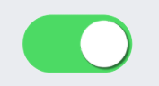
The Toggle Switch component can be used to show an on/off value. Clicking on the switch toggles between the on and off states.

The JavaScript file can be edited to create actions to use with this component.

Features

  • Visual display for binary values
  • Customizable on/off icons
  • Ability to set a default value

Properties for Toggle Switch Component

NameWhen components are placed on a page they appear highlighted blue in the scene tree and can be renamed by double clicking in this panel and typing the new name. Components can also be set to be visible/invisible on the page, using the ‘eye’ icon on this panel.
Position and SizeSets position and size. As long as measurements are maintained as percentages it deals automatically with dynamic layout and resizing for different devices and orientations. You can use millimeters to control aspects of size like width or height on order to create a component thats size will be maintained across devices.
Custom PropertiesThe properties below allow you to set the images and default value.
bkg_off_filenameSelect an image to use to show when the toggle switch is off.
bkg_on_filenameSelect an image to use to show when the toggle switch is on.
thumb_filenameSelect an image to use as the toggle that moves between the off and on positions.
ValueSet a value of 0 for off, or 1 for on, to display when the component first displays.


  • Umajin
  • Developers
  • Support Home
Menu
  • Umajin
  • Developers
  • Support Home