Menu
Glass Shelf
Displays a set of items on a rotating, reflective Glass Shelf.
Focus customer attention on your content by displaying items on a shelf. The Glass shelf is populated with items that display in a linear scrolling list.
They can be swiped to move around the shelf and snap to center front. Items can have actions attached to them.
Using the Glass Shelf Component
- Insert a Glass Shelf component into your app and your page is automatically pre-populated with a default working glass shelf with three items on it.
You can add items using the plus button on the Glass Shelf component and change the images for the preset Glass Shelf items from your ‘Resources Folder’ for this Project.
- The gap you set between tiles will determine how close the items on your shelf will be.
- Under the ‘Appearance’ section the ‘Scale of items’ is set with sliders. The ‘Scale min’ sliders reduce size from the last item that displays on the shelf forwards. The ‘Scale max’ sliders increase size from the front item that displays on the shelf backwards.
- The properties that set ‘Item Opacity’ function the same way.
- The ‘Reflection gap’ property sets the gap between your glass shelf item and its reflection and you can also apply scale/size and opacity properties to the reflected image using sliders that function just the same as they do for the items.
- Under the ‘Behavior’ section of the ‘Properties Inspector’ panel you can set the max speed and friction of the items on the shelf. If you want the items on the shelf to always snap to the center after items are swiped along then the ‘Allow Snapping’ checkbox needs to be checked and ‘Snap friction’ can also be set.
Details of how speed and friction work can be seen in the description of properties below.
- The Glass Shelf can be used to navigate your Project. All items on the glass shelf can have actions attributed to them using the Actions tab, choosing an event and selecting actions from the Action Selector.
- You can create, save and load your own preset for a glass shelf to use across Projects.
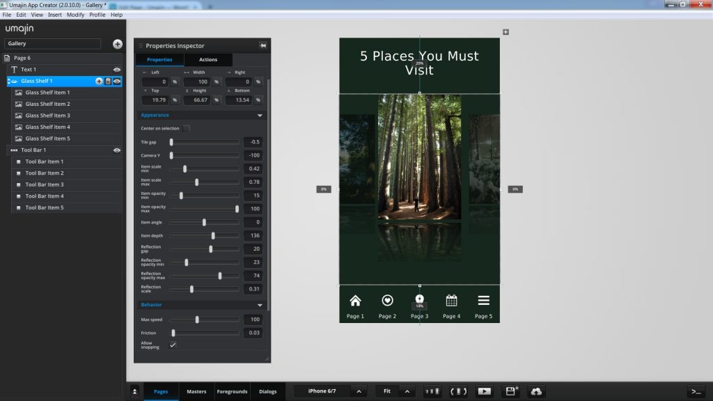
This screenshot shows an example of a ‘Glass Shelf Component’ currently displaying the ‘Glass Shelf Item 2’.
Two other items are just showing, as they wait to be swiped and viewed.
Each item could have an ‘Open Map Action’ added to it, in order to show the user the location of the attraction.
Properties for Glass Shelf Component
| Name | When components are placed on a page they appear highlighted blue in the scene tree and can be renamed by double clicking in this panel and typing the new name. Components can also be set to be visible/invisible on the page, using the ‘eye’ icon on this panel. |
| Position and Size | Sets position and size. As long as measurements are maintained as percentages it deals automatically with dynamic layout and resizing for different devices and orientations. You can use millimeters to control aspects of size like width or height in order to create a glass shelf thats size will be maintained across devices. |
| Preset | A Preset is a pre-determined set of properties and files for a Glass shelf component. You can have a Predefined Preset (Umajin created) or a Custom Preset (custom designed by you). Where the component has a Predefined Preset it will automatically be loaded into your app as the default when you insert that component. Create your own Preset by building your assets, putting them in your Image folder and then selecting them in the Properties panel. The ’SAVE’ button will enable |
Appearance
Sets the look of items on the Glass shelf.
| Center on selection | Checkbox. If checked, when swiped it will return an item to the center front of the shelf. |
| Tile gap | Set the gap between items moving around onto the shelf using a slider ranging from -0.5 (minimum distance) to 0.5 (maximum distance) |
| Camera Y | Sets the vertical position of the camera. |
| Item scale min | Set the minimum scale of items using a slider ranging from 0 .01 (small) to 2 (large). This affects the items from the rear of the glass shelf forwards. |
| Item scale max | Set the maximum scale of items using a slider ranging from 0 .01 (small) to 2 (large). This affects the central item on the glass shelf backwards. |
| Item opacity min | Set the minimum opacity of all items using a slider ranging from 0 (minimum) to 100 (maximum). This affects the items from the rear of the glass shelf forwards. |
| Item opacity max | Set the maximum opacity of all items using a slider ranging from 0 (minimum) to 100 (maximum). This affects the central item on the glass shelf backwards. |
| Item angle | Set the angle of your items as they move on the glass shelf. Rotate through -80 to 80 with 0 being a flat plane. |
| Item depth | Set how far forward/back the items sit on your glass shelf. Range is from 0 units to 500 with 0 being the front of the shelf. |
| Reflection gap | Sets the space between the items on the shelf and their reflection, ranging from -100 (small) to 100 (wide). |
| Reflection opacity min | Sets the minimum reflection on a scale from 0 (least) to 100 (maximum). This affects the reflection on the items from the rear of the glass shelf forwards. |
| Reflection opacity max | Sets the maximum reflection on a scale from 0 (least) to 100(maximum). This affects the central item’s reflection backwards. |
| Reflection scale | Sets the size of the reflection of the items, ranging from 0 (least) to 1 (maximum) |
Behavior
Sets the way the glass shelf will function.
| Max speed | Set the maximum speed that the items can spin, on a slider ranging from 0 (slow) to 255 (fast) |
| Friction | The friction on items takes effect when the user removes their finger. It starts from 0 (no friction, keep spinning) to 1 (stop immediately). |
| Allow snapping | Check the box to enable snapping of items to front center shelf. |
| Snap friction | If snapping is checked, then you can set the amount of friction on items that takes effect when the user removes their finger. It starts from 0 (no friction, keep spinning) to 1 (stop immediately). |
Glass Shelf Item Properties
Sets the image for an item on the glass shelf.
| Image | Browse Resources Folder and select images for items on the glass shelf. |
Events that can Trigger an Action on the Glass Shelf
Component
| On Stop | Action occurs when Glass Shelf Component is stopped. |
| On Change | Action occurs when the Glass Shelf Component is moved and items on it change. |
Events that can Trigger an Action on an Item on the Glass Shelf
| On Press | Action occurs when the Item is pressed. |
| On Focus | Action occurs when the Item comes into focus as the Glass Shelf is moved. |
| On Defocus | Action occurs when the Item goes out of focus as the Glass Shelf is moved. |