Menu
Carousel
This component provides an eye-catching display of a set of items that can be revolved on a 3D carousel.
As soon as you select the Carousel component your page is populated with a default preset carousel.
Each item can be changed and by using the + button on the carousel you can add further items.
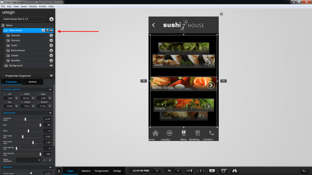
The carousel items can be swiped to revolve and tapped to select. You can control the speed and shape of the orbit of the carousel and the scale of display of each item as they come to the front. Actions can be attributed to any of the items. In this example of a vertical carousel below, the ‘Carousel Component’ has been renamed as ‘Menu items’
and the items that display in the revolving carousel are Specials, Starters, Sushi, Bento Boxes, Salads
and Noodles.
Each item has a navigation button that links to a more detailed list of dishes in that category.
There is also a preset diagonal and landscape carousel that can be loaded.
Using the Carousel Component
- By default, a vertical carousel displays.
- The default carousel has only 3 carousel items created, but because the properties are set to have 8 items displaying, these items are repeated in the vertical display.
- Likewise, you may create any number of items for your carousel but depending on how many items you set to display, then only that number will show in your carousel – but the items will move through the carousel in an ongoing loop.
- You can change the angle and tilt using the ‘Roll’ slider to alter the angle of the carousel and the ‘Pitch’ slider to alter the tilt.
- The Carousel scale alters the scale of the whole carousel.
- The Scale of items on the carousel are set with sliders. The ‘Scale min’ sliders reduce the item size from the last item that displays on the carousel forwards. The ‘Scale max’ sliders increase the item size from the front item that displays on the carousel backwards.
- The Opacity sliders function the same as Item scale sliders.
- Under the Behavior section of the Properties panel you can set the Initial speed of the carousel and if you check the ‘Snap’ box to stop the carousel at the center front each time, you can also set the strength of the ‘Snap magnet’ which in turn stops and centers the carousel more strongly.
- All items on the carousel can have their graphics changed and using the plus button on the carousel new items can be added.
- All items on the carousel have events that can have actions attributed to them using the Actions tab and selecting an action from the Action Selector.
Properties for Carousel Component
| Name | When components are placed on a page they appear highlighted blue in the scene tree and can be renamed by double clicking in this panel and typing the new name. Components can also be set to be visible/invisible on the page, using the ‘eye’ icon on this panel. |
| Position and Size | Sets position and size. As long as measurements are maintained as percentages it deals automatically with dynamic layout and resizing for different devices and orientations.You can use millimeters to control aspects of size like width or height in order to create a carousel thats size will be maintained across devices. |
| Preset | A Preset is a pre-determined set of properties and files for a carousel component. You can have a Predefined Preset (Umajin created) or a Custom Preset (custom designed by you). Where the component has a Predefined Preset it will automatically be loaded into your app as the default when you insert that component. The ‘LOAD’ button opens the Preset Selector, which has tabs for Predefined and Custom, so you can choose which preset to load for your component. Create your own Preset by building your assets, putting them in your Image folder and then selecting them in the Properties panel. |
Appearance
Sets the look of the items on the carousel and how they will revolve.
| Carousel scale | Set the size of the carousel orbit from 0.01 (tiny) to 1 (normal) to 2 (double size) |
| Roll | Set the angle of the carousel in degrees from -90 to +90. |
| Pitch | Set the tilt of the carousel in degrees from -45 to +45 |
| Item scale min | Sets minimum shrinking of cards as they revolve to the back. |
| Item scale max | Sets maximum magnification of cards as they revolve to the front. |
| Item opacity min | 0 to 100 intensity value – Sets minimum opacity of all cards as they revolve to the back with 0 being transparent. |
| Item opacity max | 0 to 100 intensity value – Sets maximum opacity of all cards as they revolve to the front with 0 being transparent. |
| Items displayed | Enter how many cards will be visible in the carousel. (5 is probably the minimum number of cards required to make a carousel look good on device.) |
Behavior
Sets the behavior of the carousel.
| Initial speed | Sets initial speed of carousel on a scale of -30 to 30. |
| Max speed | Sets highest speed the cards will revolve. Scale 5 to 50 with 50 being maximum. |
| Friction | The friction on the carousel takes effect when the user removes their finger. It starts from 0 (no friction, keep spinning) to 1 (stop immediately). |
| Snap | Makes the front most carousel item center itself after movement. |
| Snap Magnet | Set the strength of the snapping. 0 (no speed after release) to 1 (instant snap on release) |
Carousel Item Properties
Each item can be changed by selecting a new image in the properties panel for each item.
The plus button on the carousel component can be used to add further items to
the carousel.
| Image | Select the filename of your image/graphic for the carousel item from your Image folder. |
Events that can trigger an Action on the Carousel
Component
| On Stop | Action occurs when Carousel Component is stopped. |
| On Change | Action occurs when the Carousel Component is rotated and items on it change. |
Events that can trigger an action on an item on the
carousel
| On Press | Action occurs when the Item is pressed. |
| On Focus | Action occurs when the Item comes into focus as the carousel is rotated. |
| On Defocus | Action occurs when the Item goes out of focus as the carousel is rotated. |