Menu
Scroll Panel
Scroll long areas of content with dynamic layout and resizing for different devices and orientations.
This component provides a container that can have a group of other components displaying inside it.
They can be placed on the page together and scrolled as a list or with the optional scroll bar.
The scroll panel can be horizontal or vertical.
This screenshot shows a vertical scroll panel with its images set up to display within the scroll panel.
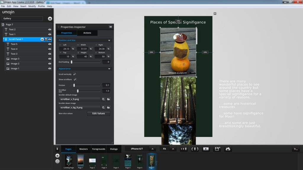
When the Project is viewed the scroll panel can be scrolled down and up with the scroll bar to display the sequence of images.
 |  |  |
How to use the Scroll Panel Component
- The Scroll Panel Component is found in the Layout section of the Component Selector. Insert it into your Project. By default the vertical scroll panel is checked so your scroll panel is designated to be vertical unless you uncheck the box.
- Size the scroll panel to the dimensions that you want to view content in on the page. This could be horizontal or vertical.
- If you want a scroll bar, it sits on the edge of the scroll panel, so any part of your content that sits outside the scroll bar will be cropped.
- Add components to the scroll panel component.
- When previewed the content can be scrolled by swiping, pulling or using the scroll bar.
Properties for Scroll Panel Component
| Name | When components are placed on a page they appear highlighted blue in the scene tree and can be renamed by double clicking in this panel and typing the new name. Components can also be set to be visible/invisible on the page, using the ‘eye’ icon on this panel. |
| Position and Size | Sets position and size. As long as measurements are maintained as percentages it deals automatically with dynamic layout and resizing for different devices and You can use millimeters to control aspects of size like width or height in order to create a group that will be well positioned across devices. |
Appearance
Sets the look and functionality of the scroll panel.
| End Padding | Sliding scale of 0 to 500 |
| Scroll vertically | Checkbox to opt for vertical scrolling |
| Show scrollbars | Checkbox to opt for visible scroll bar |
| Friction | Set the amount of friction when dragging the scrollbar, using a slider on a scale of 0.01 to 1. |
| Scrollbar size | Set scrollbar width from 0.5 to 5 mm. |
| Scroller default image | Set the graphic for the scrolling bar in default mode. |
| Scroller down image | Set the graphic for the scrolling bar when it is scrolled downwards. |
| Nine slice values | Edit the values of the scroll bar graphic’s edges to maintain the desired shape. |
Events that can Trigger an Action on the Scroll Panel Component
| On Pull to Refresh | Action occurs when the scroll bar or panel is pulled to the bottom of the panel, enabling the data to be refreshed. |