Menu
Gallery
This easy to use component enables you to display content in a streaming format that you can zoom and pan.
You can take images as .jpgs or .pngs and add them in numbered order to a gallery folder created within your Project’s Resource folder of images and they will automatically display on device.
You can also convert previously created Powerpoint files, Excel files, Word docs to .pngs and display that content through the Gallery component.
The Gallery component is pre-set with a group of optional sub-component buttons.
These buttons enable the user to tab backwards and forwards through the gallery, to view images fullscreen and to zoom in and out and pan around any image.
How to use the Gallery Component
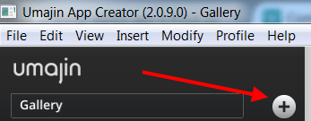
To insert any component you click the large ‘plus’ button beside the Project name. You can also use ‘Insert’ on the top menu bar.
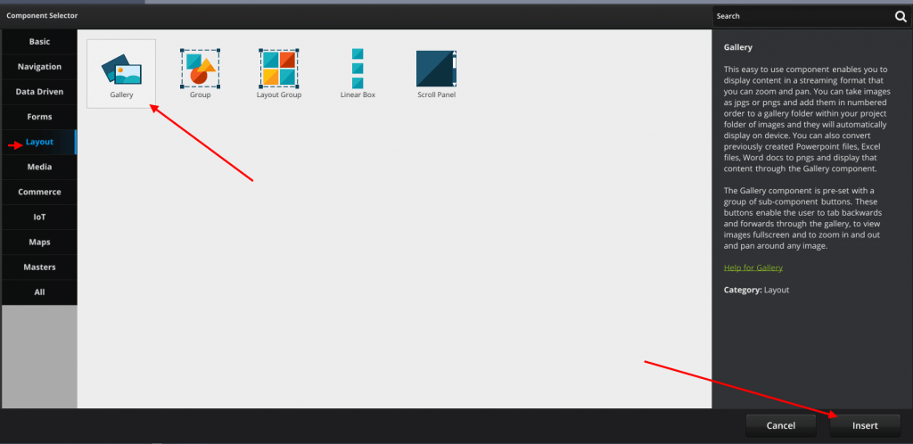
Both actions will open the ‘Component Selector’. Under the Layout Tab, we are going to select the ‘Gallery’ component and click ‘Insert’
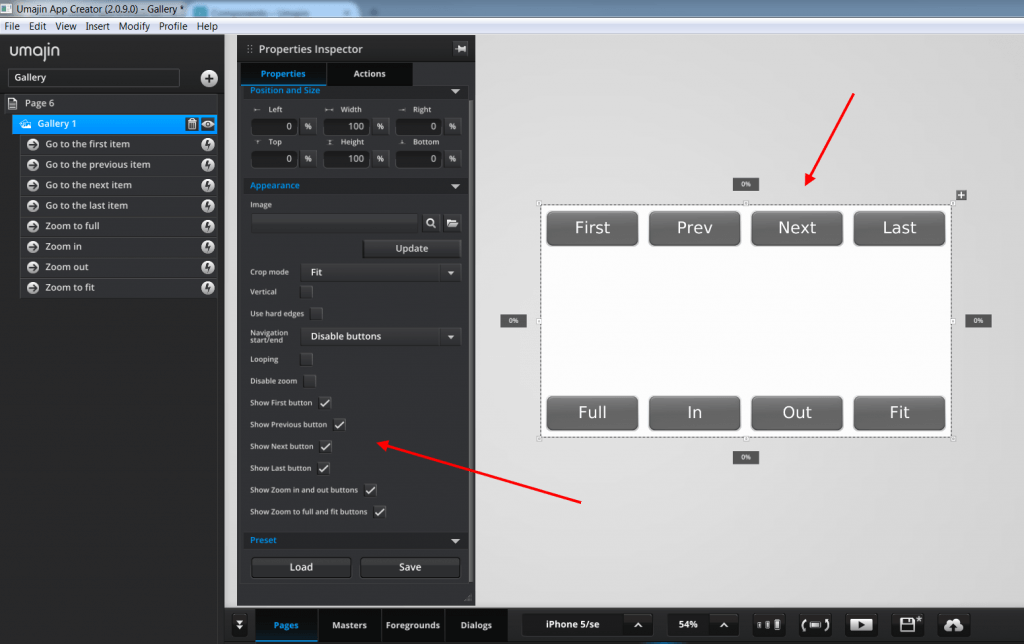
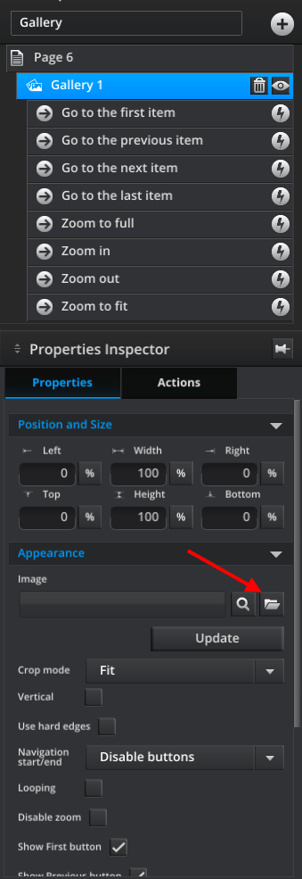
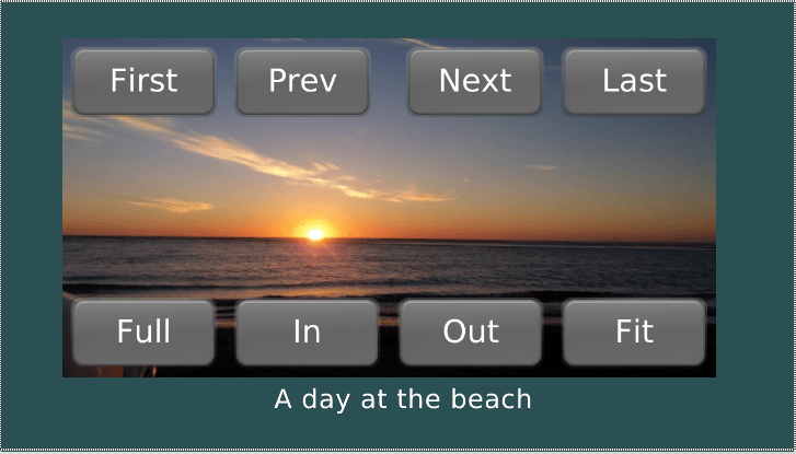
The ‘Gallery’ component is pre-populated in the Scene tree with 8 navigation buttons as you can see in the screenshot below.
They are currently unchecked in the ‘Properties Inspector’ panel so they do not display on the screen.
We have unpinned and expanded the ‘Properties Inspector ‘ panel so all the buttons are showing.
You have the option to check all the buttons or just the buttons you want to display.
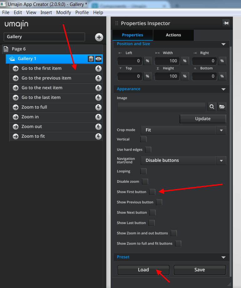
If you click the ‘Load’ button in the Preset section at the bottom of the Properties Inspector panel the standard gallery component will display that has all of its 8 buttons showing.
You can choose to keep them all or uncheck some you don’t want.
To add content to the Gallery component, select the ‘Gallery’ component in the scene tree and then in the ‘Properties Inspector’ under the ‘Properties’ tab, under the ‘Appearance’ heading, beside ‘Image’, click the ‘Folder’ icon to access this Project’s file of images.
This opens the ‘Images’ folder which sits inside this Project’s ‘Resources Folder’.
Each project has its own Resource folder.
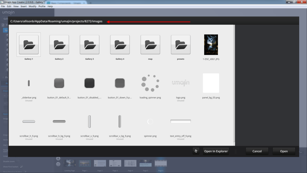
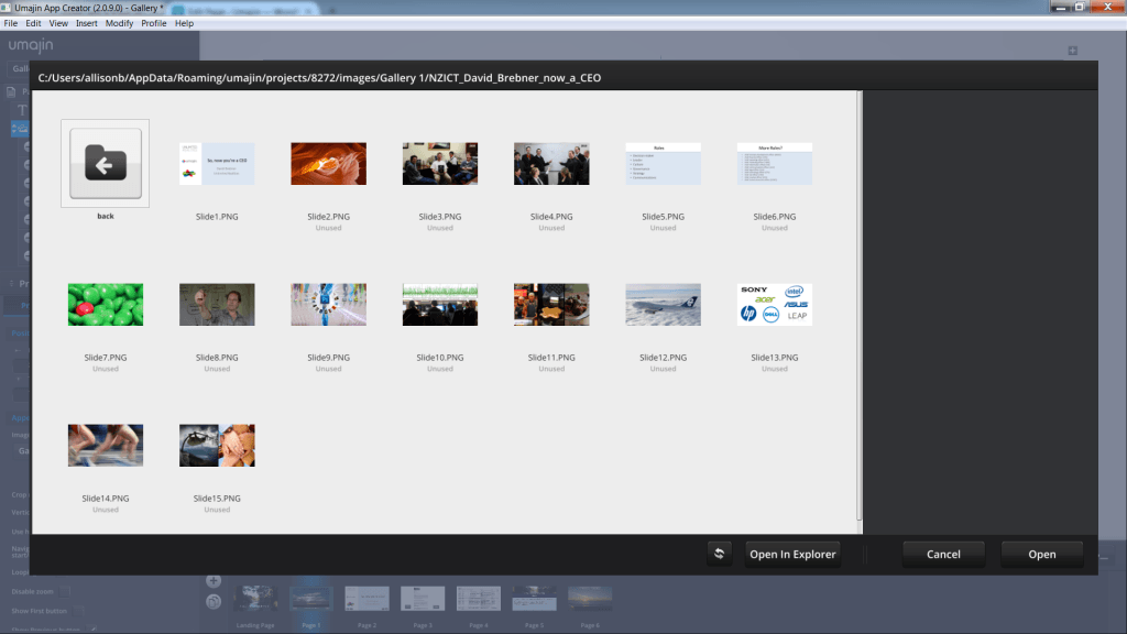
The screenshot above shows our ‘images’ folder. It is already set up with 4 Gallery folders.
It is useful to organize your content into folders that sit inside the ‘Images’ folder. Your folders can contain either .jpg or .png files.
You need to convert Powerpoint, Excel or Word files into one of these 2 formats to display in a gallery component.
You can also use the ‘File’ menu in the top menu bar to access content. Click ‘File’, then ‘Open Resources Folder’ and then the ‘images’ folder.
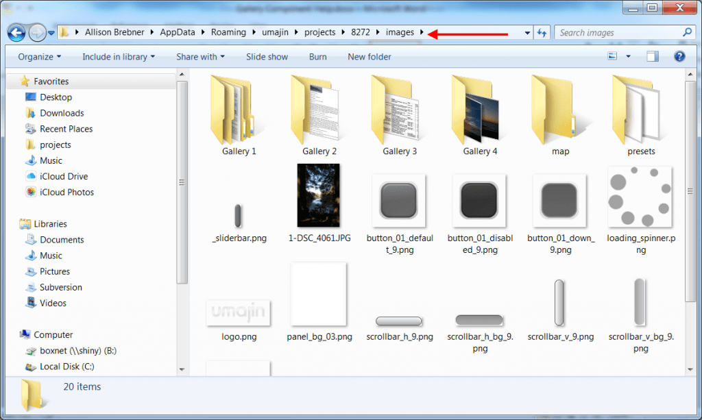
In the screenshot above you can see that in this example the 4 folders all contain different types of content. Gallery 1 has a Powerpoint file converted to .pngs, Gallery 2 has a Word doc converted to a .png,
Gallery 3 has an Excel worksheet converted to a .png and Gallery 4 has photos saved as .jpgs.
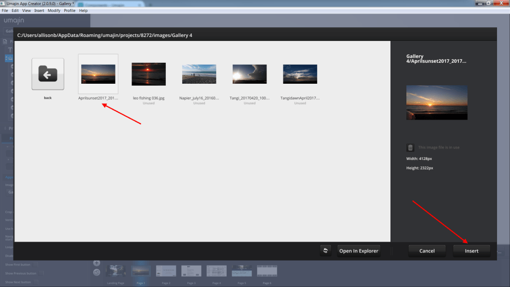
Our example will show how to create a simple picture gallery without navigation buttons. With the ‘Gallery’ component selected, in the ‘Properties Inspector’ panel, under the ‘Appearance’ heading, click the folder beside ‘Image’.
We will open the ‘Gallery 4’ folder which has our .jpg photos in it. We only need to select the first image and then all the other content will automatically load and populate our ‘Gallery’ component.
The Gallery component is so simple to use that we can immediately play our app using the ‘play’ arrow (insert from media files) and preview our photo gallery by clicking through it or swiping on a touchscreen.
We can zoom in and out of images with the mouse wheel or pinch and zoom on a touchscreen.
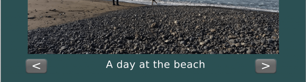
As you see in the screenshot below we have set the photos in a frame and set our crop mode to ‘Fill’. Our first example was designed to have no navigation buttons but if we decided we wanted them we could check all (or some) of the Navigation buttons and they will all display on the screen. They are already set up with actions so that they will function as labelled.
These buttons can be deleted and configured as you wish by amending their properties in the ‘Properties Inspector’ panel for each ‘Button’ component. In this case, we have retained the ‘Previous’ and ‘Next’ buttons. We have re-positioned them, resized them and changed the text to arrows.
The process for creating any other gallery is the same, as long as files are converted to .jpg or .png.
In the Properties Inspector panel for this Gallery folder, under the ‘Appearance’ heading, in the ‘Image’ panel, select the ‘Slide 1.png’ from this folder and when ‘play ‘is pressed all the PPT slides will display in the app and we can move through the presentation as we wish.
The same process applies to display the ‘Word’ or ‘Excel’ files that are stored in Galleries 2 and 3.
The ‘Gallery’ component has 2 Events-‘On Press’ and ‘On Change’- that can have some special gallery actions attached to them.
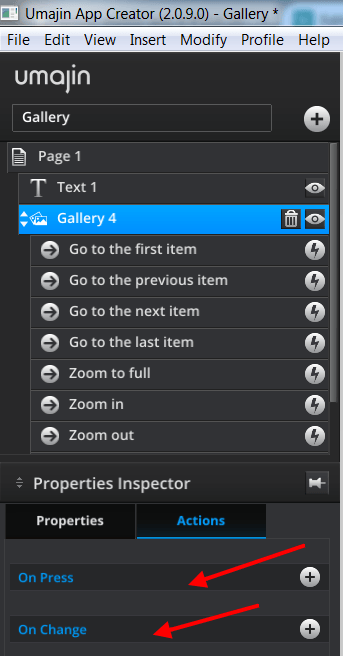
Below is a screenshot of the 5 dedicated Gallery actions.
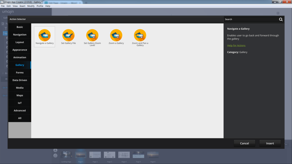
The five gallery actions are:
- Navigate a Gallery – enables user to go back and forward through the gallery.
- Set Gallery File – specify an initial image file and the Gallery will load it and any other images in that same folder. Useful for embedding a Gallery in a ‘Feed Item View’ component and having the Feed tell the Gallery what images to load.
- Set Gallery Zoom Level – Zooms on the current image in the Gallery to the specified level.
- Zoom a Gallery – enables a user to zoom into images in a gallery.
- Zoom and Pan a Gallery – enables a user to zoom and pan around any image in the Gallery.
Have fun with this Gallery component. This is a simple introduction to a component that you will find very useful for displaying many different types of content.
Properties for Gallery Component
| Name | When components are placed on a page they appear highlighted blue in the scene tree and can be renamed by double clicking in this panel and typing the new name. Components can also be set to be visible/invisible on the page, using the ‘eye’ icon on this panel. |
| Position and Size | Sets position and size. As long as measurements are maintained as percentages it deals automatically with dynamic layout and resizing for different devices and orientations. You can use millimeters to control aspects of size like width or height in order to create a |
| Preset | A Preset is a pre-determined set of properties and files for a component. You can have a Predefined Preset (Umajin created) or a Custom Preset (custom designed by you).Where the component has a Predefined Preset it will automatically be loaded into your project as the default when you insert that component.The ‘LOAD’ button opens the Preset Selector, which has tabs for Predefined and Custom, so you can choose which preset to load for your component. Create your own Preset by building your assets, putting them in your Image folder and then selecting them in the Properties panel. The ’SAVE’ button will enable you to name and save your preset under the Custom tab. |
Appearance
| Image | Select folder of images. |
| Crop mode | Dropdown to select Fit or Fill. |
| Vertical | Checkbox to set gallery to vertical. |
| Use hard edges | When checked, the gallery cannot be scrolled past the edge of the first or last image. |
| Navigation start/end | When looping is set to false, this property determines what should happen to the buttons when the first or last image in the directory is displayed. Dropdown to select option: Do nothing, Disable buttons, Hide Buttons. |
| Looping | Checkbox to set gallery to loop through the images again, once the last image has been reached. |
| Disable zoom | When false, the image is unable to be zoomed with gestures or mouse events. The zoom buttons still work. |
| Show ‘First’ button | Enable/disable the First Button. |
| Show ‘Previous’ button | Enable/disable the Previous Button. |
| Show ‘Next’ button | Enable/disable the Next Button. |
| Show ‘Last’ button | Enable/disable the Last Button. |
| Show ‘Zoom’ in and out buttons | Enable/disable the Zoom In and Zoom Out buttons. |
| Show ‘Zoom’ to full and fit buttons | Enable/disable the Zoom to Fullsize and Zoom to Fit buttons. |
Events that will trigger an Action for the Gallery Component
| On Press | Action will take place when the component is pressed. |
| On Change | Action will take place when the image changes. |