Menu
Button
Buttons provide a standard mechanism for users to move around a project and to select and submit their choice of options.
Any shape, color and size of button can be designed. Each button can have a different image or color state for default, down, and disabled. Buttons provide a standard way of communicating to your users about actions they can perform – you can use both icons and text on the button to emphasize your brand and convey the button’s function.
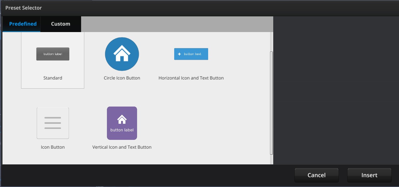
The Button component has several preset options that can be loaded.
Setting up a button
- The Button component comes with a default preset look.
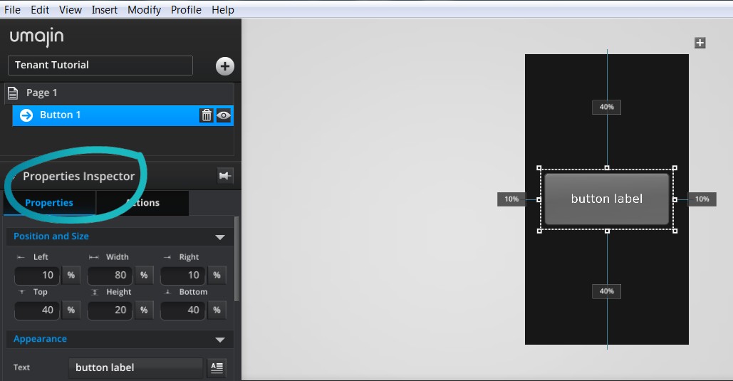
- Using the ‘Properties Inspector’ you can manually change many properties of the button.
- To change the button graphics you can use the digital assets you have created and stored in the Project’s ‘Resources Folder’ /’images’ folder. You could have designed background textures, background images, blocks of color, graphics, logos or any branded designs.
- Text style, color, size and content can be customized to your requirements.
- You can add an icon you have designed to the button as well. You can position it, reduce its scale and adjust its properties as required.
- Several pre-defined presets are available to be loaded that will display different buttons.
- When you create your own customised button you can save it as a button pre-set to be used across projects.
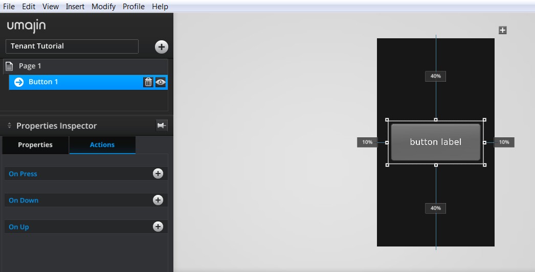
- Use the Actions tab to add Actions to any of the following events set on the Button Component: ‘On Press’, ‘On Down’, ‘On Up’.
Properties for Button Component
| Name | When components are placed on a page they appear highlighted blue in the scene tree and can be renamed by double clicking in this panel and typing the new name. Components can also be set to be visible/invisible on the page, using the ‘eye’ icon on this panel. |
| Position and Size | Sets position and size. As long as measurements are maintained as percentages it deals automatically with dynamic layout and resizing for different devices and orientations. You can use millimeters to control aspects of size like width or height on order to create a button that will maintain its size across devices. |
| Preset | A Preset is a pre-determined set of properties and files for a component. You can have a Predefined Preset (Umajin created) or a Custom Preset (custom designed by you). Where the component has a Predefined Preset it will automatically be loaded into your app as the default when you insert that component. The ‘LOAD’ button opens the Preset Selector, which has tabs for Predefined and Custom, so you can choose which preset to load for your component. Create your own Preset by building your assets, putting them in your Image folder and then selecting them in the Properties panel. The ’SAVE’ button will enable you to name and save your preset under the Custom tab. |
Appearance
| Text | Enter a text label for your button in the text editor panel. |
| Default image | Select image that will display on the button when it is in normal display state. |
| Down image | Select image that will display when the button is pressed. |
| Disabled image | Select image that will display on the button if it is disabled. |
| Nine Slice Values | Preserve the edges and corners of any images you have used. Editing values in the Nine Slice will apply to the button default, down and disabled images.
|
| Border Scale | Slider to control roundness of corners. |
| Text Scaling | Dropdown to select either Scale with screen or Fixed Size. |
| Scale border with screen | Checkbox to set border to scale with screen – otherwise border is fixed. |
| Text X Position | Set the horizontal placement of the text on your button on a scale of 0 to 1. |
| Text Y Position | Set the vertical placement of the text on your button on a scale of 0 to 1. |
| Hide Text | Checkbox to toggle text visibility on or off. |
| Keep aspect ratio | This property maintains the ratio of the asset as it is stored in the Image folder. |
| Icon image | Sets the icon you select from the Image folder to show on your button. |
| Icon scale | Adjust the size of your icon on the button, you can set it from 0.2 to 1 (full size). |
| Icon X Position | Set the horizontal position of the icon on your button on a scale of 0 to 1. |
| Icon Y Position | Set the vertical position of the icon on your button on a scale of 0 to 1. |
| Opacity | Set how opaque all imagery/text on buttons will display on a scale of 0 to 1, with 0 being totally translucent. |
Text Style
| Base Style | Set style and appearance of your text using the Styles Inspector. The Styles Inspector is accessible through the Edit Style ‘pencil’ icon under the Text Style Properties and from the Files Menu ‘Styles’. The dropdown will display all the styles you have set in the Styles Inspector. Whichever style you have selected will populate the properties below. If you alter any of the properties below for a specific use on a page, then clicking the Refresh arrow will revert the style back to its original state. Create Style – opens the Styles Inspector so you can create a new style. The new style will be added to the dropdown. Organize Style – opens the Styles Inspector. |
| Font size | Set font size using plus and minus buttons. |
| Font Color | The color preview shows the color picker. Move around the color pad to select your color you want. It displays with its web hex code at the top and shows the RGB values below. If you know the hex code or RGB numbers you can type it directly into the boxes. |
| Opacity | Set how opaque the text will display on a scale of 0 to 1, with 0 being totally translucent. |
| Font | The drop down displays all the fonts you have in your project. Select the font you want to use. |
| Tracking | Use this property to adjust the distance between your text characters. |
Accessibility
| Icon alt text | Alternative text to aid accessibility on the web. |
Events that can Trigger an Action on the Button Component
| On Press | Action occurs when component is pressed |
| On Down | Action occurs when the button is held down. |
| On Up | Action occurs when the button is released. |