• Overview
    • Introduction
    • User Interface Description
    • Installing Umajin
    • Shortcuts
    • Asset Management
    • Responsive Content
    • Project Icon
    • Text Styles
    • Guidewires
    • Presets
    • Glossary
    • Multi-user
  • Components
    • Intro
    • Page
    • Basic
      • Arrow
      • Button
      • Circle
      • HTML Article
      • Image
      • Image Zoomer
      • Nine Slice
      • Rectangle
      • Text
      • Tiler
      • Toggle Button
      • Web View
    • Navigation
      • Carousel
      • Dropdown Menu
      • Glass Shelf
      • Hamburger Menu
      • Tool Bar
    • Data Driven
      • Animated Feed
      • Dynamic Article
      • Feed Item View
      • Feed List
    • Forms
      • Form
      • Text Entry
    • Layout
      • Gallery
      • Group
      • Layout Group
      • Scroll Panel
    • Media
      • 3D Model
      • Spine Animation
      • Lottie Animation
      • Avatar
      • Canvas
      • Particle
      • Render Kit
      • Speech Player
      • Video
    • Maps
      • Google Maps
      • Offline Map
      • Offline Map Route Editor
      • Map creation guide
      • Beacon installation for indoor mapping
    • Internet of Things (IoT)
      • Bluetooth BLE
    • Masters
    • Custom Components
  • Actions
    • Add and Configure Actions
    • Basic Actions
    • Navigation Actions
    • Layout Actions
    • Appearance Actions
    • Animation Actions
    • Media Actions
    • Avatar Actions
    • Gallery Actions
    • Form Actions
    • Data Driven Actions
    • Maps Actions
    • IOT (Internet of Things) Actions
    • Advanced Actions
    • Custom Actions
  • Tutorials
  • Cloud Services
    • Overview of Cloud Services
    • Google Analytics
    • Umajin Analytics
  • Publishing
    • Introduction
    • Umajin Editor Lite
    • iOS – Apple App Store
    • Android – Google Play Store
    • Mac
    • Windows
Menu
  • Overview
    • Introduction
    • User Interface Description
    • Installing Umajin
    • Shortcuts
    • Asset Management
    • Responsive Content
    • Project Icon
    • Text Styles
    • Guidewires
    • Presets
    • Glossary
    • Multi-user
  • Components
    • Intro
    • Page
    • Basic
      • Arrow
      • Button
      • Circle
      • HTML Article
      • Image
      • Image Zoomer
      • Nine Slice
      • Rectangle
      • Text
      • Tiler
      • Toggle Button
      • Web View
    • Navigation
      • Carousel
      • Dropdown Menu
      • Glass Shelf
      • Hamburger Menu
      • Tool Bar
    • Data Driven
      • Animated Feed
      • Dynamic Article
      • Feed Item View
      • Feed List
    • Forms
      • Form
      • Text Entry
    • Layout
      • Gallery
      • Group
      • Layout Group
      • Scroll Panel
    • Media
      • 3D Model
      • Spine Animation
      • Lottie Animation
      • Avatar
      • Canvas
      • Particle
      • Render Kit
      • Speech Player
      • Video
    • Maps
      • Google Maps
      • Offline Map
      • Offline Map Route Editor
      • Map creation guide
      • Beacon installation for indoor mapping
    • Internet of Things (IoT)
      • Bluetooth BLE
    • Masters
    • Custom Components
  • Actions
    • Add and Configure Actions
    • Basic Actions
    • Navigation Actions
    • Layout Actions
    • Appearance Actions
    • Animation Actions
    • Media Actions
    • Avatar Actions
    • Gallery Actions
    • Form Actions
    • Data Driven Actions
    • Maps Actions
    • IOT (Internet of Things) Actions
    • Advanced Actions
    • Custom Actions
  • Tutorials
  • Cloud Services
    • Overview of Cloud Services
    • Google Analytics
    • Umajin Analytics
  • Publishing
    • Introduction
    • Umajin Editor Lite
    • iOS – Apple App Store
    • Android – Google Play Store
    • Mac
    • Windows
Overview > Introduction > Text Styles
Contents
  • Intro
  • Interface Description
  • Installing Umajin
  • Shortcuts
  • Asset Management
  • Responsive Content
  • Project Icon
  • Text Styles
  • Guide Wires
  • Presets
  • Glossary
  • Multi-user

Text Styles

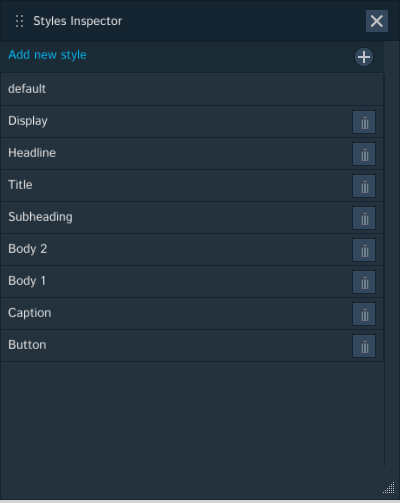
Umajin has a style editor labelled the ‘Styles Inspector’ which can be used to set styles that will apply globally across your project. There is an existing default style which can be altered as required and then you can add as many other styles as you wish for Display, Headline,Title, Subheading, Body 2, Body 1, Caption, Button or Add New Style.

The ‘Styles Inspector’ is accessed from the ‘File’ menu dropdown under ‘Styles’. It can also be accessed using the pencil icon beside the ‘Base style’ dropdown under the ‘Text Style’ heading in the ‘Properties Inspector’ of any page that has a text component on it. The ‘Base Style’ dropdown also provides options to ‘Create a Style’ and ‘Organize Styles’. Once you have created new styles for Headings or Body text or whatever, then using the ‘Base style’ dropdown back in the component’s ‘Property Inspector’, you can quickly apply whichever style is appropriate.

Changing Default Style

All Components with text will have the default style applied automatically, as shown in the screenshot below.

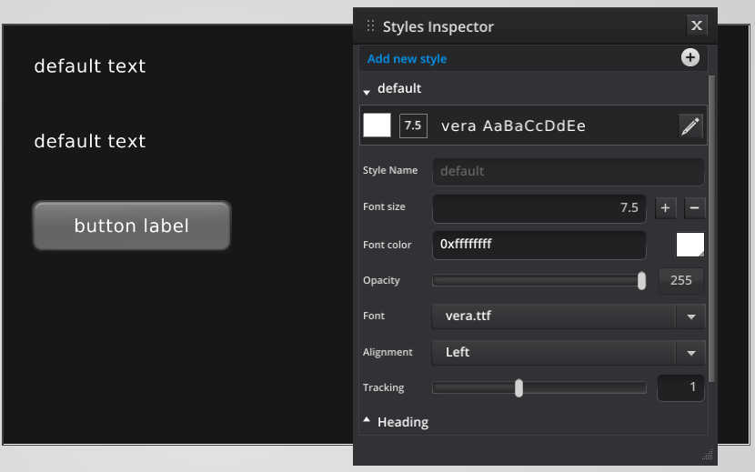
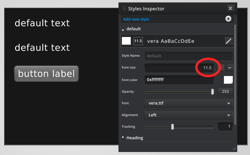
By changing the default font size, all components with that style applied, anywhere in the application, will reflect that change. The change seen below is an increase in the font size from 7.5 to 11.5.

Creating and Adding Styles

Using the Styles Inspector, select the type of style you want to create to use across your Project. It could be a Heading style or the style of text on Buttons. Simply follow the same steps as for changing the default style and you will be able to apply it using the ‘Style’ dropdown in the properties panel.

You can add new styles using the + button on the Styles Inspector. Naming them appropriately will make it easy to select them from the dropdown of styles and to then apply them across your Project in the right places.

Overriding a Text Style

When you have set a text style you can also override it for a specific instance on a component. Change the settings as you wish in that Component’s ‘Properties Inspector’ under the ‘Text Style’ heading (size, color, opacity, font, alignment). Whichever aspect of the style properties you choose to change will display a small plus icon.This indicates which properties have been altered. The text will change accordingly for this page only.

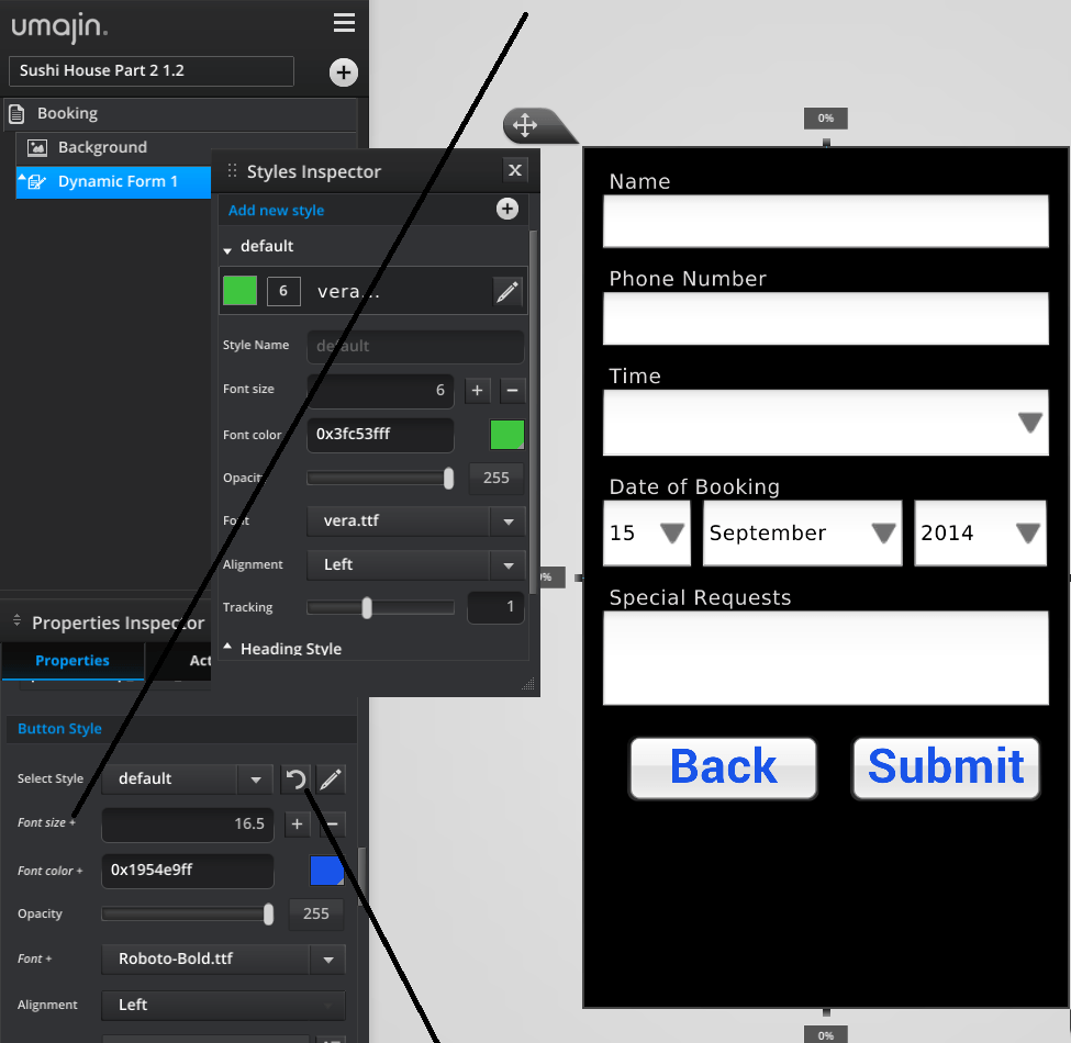
f you want to revert it back to the original settings just click the refresh arrow, beside the pencil icon.

If you change a property in the main ‘Styles Inspector’ editor, however, this style change will then become global across your whole project.

How to Add Fonts

When you want to add your own fonts to an App

  1. Go to the File menu
  2. Go to ‘Open Resources Folder
  3. Copy any OTF (Open Type Fonts) or TTF (True Type Fonts) font files into the Fonts folder
  4. Make sure you have the rights to embed the fonts.
  • Umajin
  • Developers
  • Support Home
Menu
  • Umajin
  • Developers
  • Support Home