Menu
Form
This component provides a form that will collect information from the user. A simple example is collecting
customer feedback with contact details and comments.
The data can easily be saved into the Umajin Cloud, and can be retrieved from there as a CSV file download.
Creating a new form
When you insert the ‘Form Component’ it will be automatically populated with a group of working
inner components, making up a functional example; a contact form.
The example shows the way that submission and validation can work together.
It will have Text labels, Text Entry fields, a Cancel Button and a Submit Button. There will also be some
red error Text Labels that will display (in play mode) if the user’s text entry is not validated.
You can delete or change any of these components if you don’t need them.
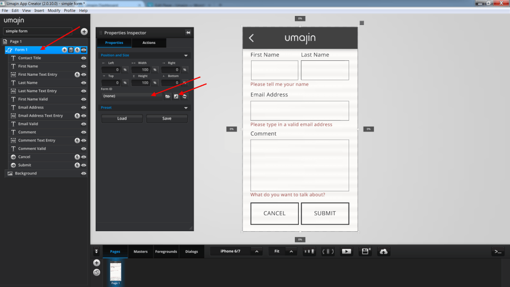
After inserting the form, we can set up data collection using the Umajin Cloud. To open the Umajin Cloud,
click on the Form component to open the Properties Inspector then click on the diagonal right facing arrow
beside the Form ID field.
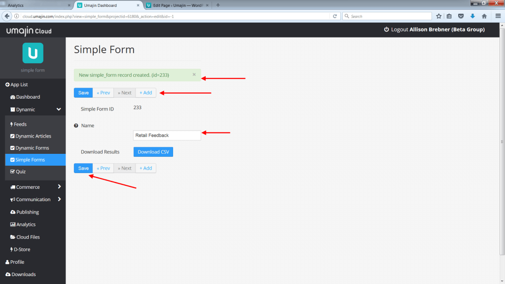
This will open up a page in your web browser. On the page add a Simple Form feed by pressing the + button.
Type in a form name (we’re using Retail Feedback), and press the save button. A Form ID will be
allocated.
Next we need to go back to the Umajin Editor so that we can bind the newly made feed to our Form component.
Select the Form component and go to the properties inspector for it. In the Properties Inspector, under the Form ID property, click on the folder or
the box to open the feed picker and select the ‘Retail Feedback’ feed we just created.
 | 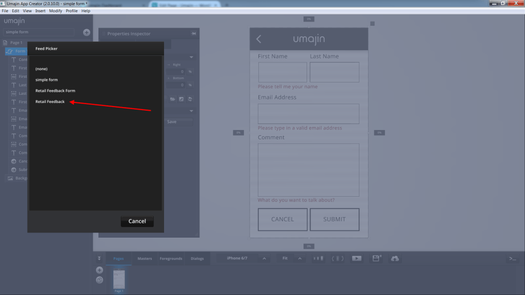 |
The Form and the ‘Retail Feedback’ feed we created in the Umajin Cloud are now linked together.
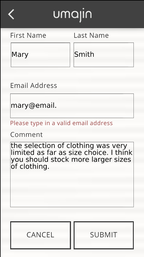
When the user enters information into the text entry fields and presses the submit button, the app will
first check if all the information is valid (such as email) and all required fields are filled in.
 |  |
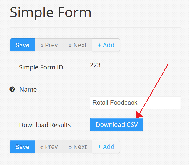
This data can be retrieved by going back to our web browser with the Umajin Cloud page and clicking the
‘download’ button. If you closed the page, you can reopen it quickly by clicking on the arrow button next to
Form ID in the Form component’s Property Inspector.
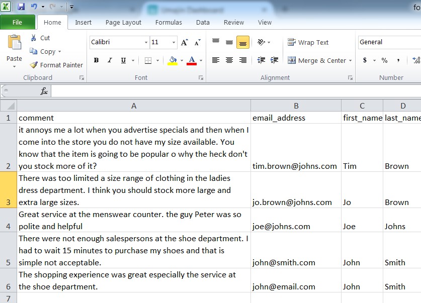
The data is downloaded as a CSV file. These are commonly viewed in Microsoft Excel and Google Spreadsheets.
They can also be opened as a text file with a program like notepad.
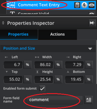
The column headers are created from the Form field name property for each component within the form.
When setting up your form you should make sure all the form field components have their “Form field name”
property be unique and a good title for the data it gathers.
The data is grouped under the appropriate headers. Try changing the form field name and see how the data changes.
 |  |
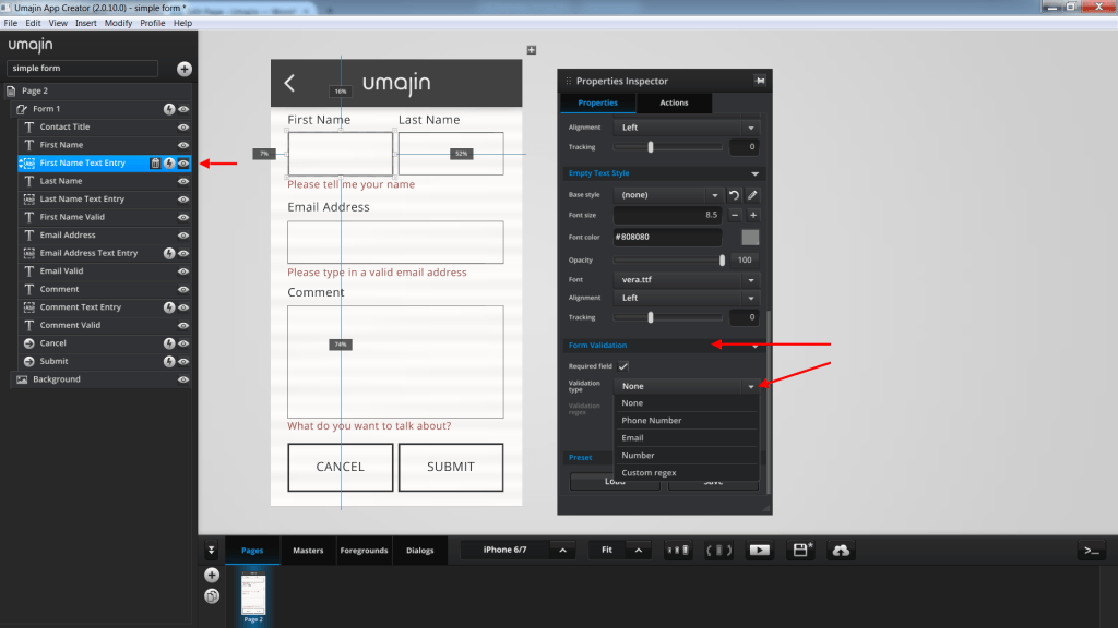
Form validation
In the ‘Properties Inspector’ for each of the ‘Text Entry Components’, under the heading ‘Form Validation’
there is a property called “Validation type”. This can be set to any of the options in the drop down. When the user
tries to submit the form, if the text entered into any text entry does not match the validation type selected, then it
is considered invalid and the form will not send.
An advanced option is to select the “Custom regex” option from the dropdown. You can enter in a regex text
into the “Validation regex” property below it and it will use this to validate the text. (See below for more
on regex.)
There is also a “Required Field” checkbox option. If this is checked, then even if no validation type is
selected, it will still fail to send if that field is empty.
If you don’t want one of your text entry components to send its contents when the form is submitted and for
the form to not check if it is valid, then you can uncheck the “Enabled form submit” checkbox.
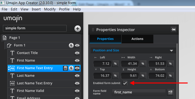
Alternatively if you are using JavaScript for complex form submission you can turn this on for components
that aren’t normally used on a form. For Javascript custom components, the from “value” can be set with
setData(component, “value”).
If you want to do much more complicated validation on your text entry component then you can use JavaScript
in the text entry component’s “On Custom Validation” event. This event triggers after the default validation code
has run so that you override it. It runs before the events are fired for “On Fail Validation” and “On Pass Validation”
validation so that these take into account the results of your custom validation code. You just need to write true or
false to the text entry component’s “passed_form_validation” property.
The error labels
The 3 default error Text Labels have been setup to start hidden when the page plays/shows. You can see this
if you go to play mode. Each one is paired with a text entry box.
- Text component renamed as ‘First Name Valid’
- Text component renamed as ‘Email Valid’
- Text component renamed as ‘Comment Valid’
If you type something invalid into its text entry and tab to the next one or press submit then the label will show,
alerting the user to the error. If you go back and enter something valid and try again then the label will hide.
This system is done in each of the Text Entry Components in their Property Inspector ‘Actions’ tab. The “On
Fail Validation” and “On Pass Validation” events show and hide the labels. The labels are made to start
hidden using the Form’s event “On Page Show” to hide all three error labels. You can also have labels start
hidden by unchecking their “start visible” property.
Events on the Form that trigger Actions
The Form has the event, “On press”, which can have actions attributed to it.
The Form has the “On Before Submit” event which happens when you press the submit button and is meant to be
used to add in your own form validation checking with JavaScript. Each item in the Form that has “Enabled
form submit” will have a hidden property called “passed_form_validation” set based on its selected form
validation. In JavaScript you can inspect this property, inspect the text and perform your own tests and
then set the “passed_form_validation” to false if you want it to fail and true if you want it to succeed.
Next the Form checks each of its fields that have Enabled form submit on, to make sure that the
“passed_form_validation” property is true. If any of these items is false then the “On Validation Fail”
event will occur. The default setup shows a popup with a simple message to the user to let them know the
form failed validation.
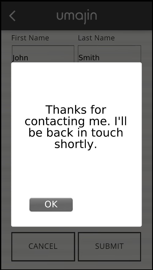
If the Form passes validation then it will try to send its data to the dashboard. If for some reason, such
as no internet connection, the Form fails to send then the “On Send Fail” event will trigger. The default
setup again shows a popup to let the user know. If the Form sends correctly then we get an “On Send Success”
event. The default setup uses this to reset the Form and show a popup to inform the user.
The Form has the event “On Page Show” which is the same as the “On Before Page Shows” event that pages have.
Forms often have some initial setup we want to do, so this allows us to group it all under the form rather
than adding it to the Page event.
- ‘On Press’ – an action of your choice can be added
- ‘On Before Submit’ – an action of your choice can be added
- ‘On Validation Fail’ will show a popup with a message you can customize
- ‘On Send Success’ will show a popup with a message you can customize, reset to a selected page, and
set component visibility to hide/show or toggle as long as name, email and comment are valid entries - ‘On Send Fail’ will show a popup with a message you can customize
‘On Page Show’ will set component visibility to hide/show or toggle as long as name, email and
comment are valid entries
Using JavaScript
Instead of using the “Submit Form” action which is on the submit button by default, you can call a custom JavaScript action. From here you can do whatever you want, inspect fields, validate them, and send the data to your own server instead of the Umajin Cloud.
You can use checkFormValidation() on the Form Component from JavaScript which will run the default form validation. You can then add your own custom form validation code after this.
You can use gatherFormData() to get all the form data as a JSON string.
You can use disperseFormData() to populate a Form Component from a JSON string. This can be useful if you want a user to be able to stop halfway through filling out a form, restart the app and have the form remember where they left off.
You can use formFieldValidation() on a Text Entry Component to force a validation check and raise its pass/fail events. Setting the text from JavaScript does not trigger these events by itself.
Tutorial on how to customize a simple Form
Tutorial on
customizing a simple Form
Default Components that populate the Form Component
| Contact Title | Text Component with all the normal Text component properties. Heading for Form. |
| First Name | Text Component with all the normal Text component properties. It displays a caption for the Form. |
| First Name Text Entry | Text Entry Component for user to enter first name. Has all Text Entry Properties, including the option to make it a required field. In the Actions panel, this component also has ‘Pass’ and ‘Fail’ validation events that when activated can show, hide or toggle the component. |
| Last Name | Text Component with all the normal Text component properties. It displays a caption for the Form. |
| Last Name Text Entry | Text Entry Component for user to enter last name. Has all Text Entry Properties, including the option to make it a required field. |
| First Name Valid | Text Component with all the normal Text component properties. It displays the instruction to enter the first name if the user’s original entry was not validated. |
| Email Address | Text Component with all the normal Text component properties. It displays a caption for the Form. |
| Email Address Text Entry | Text Entry Component for user to enter email address. Has all Text Entry Properties, including the option to make it a required field. In the Actions panel, this component also has ‘Pass’ and ‘Fail’ validation events that when activated can show, hide or toggle the component. |
| Email Valid | Text Component with all the normal Text component properties. It displays the instruction to enter a valid email address if the user’s original entry was not validated. |
| Comment | Text Component with all the normal Text component properties. It displays a caption for the Form. |
| Comment Text Entry | Text Entry Component for user to enter a comment. Has all Text Entry Properties, including the option to make it a required field. In the Actions panel, this component also has ‘Pass’ and ‘Fail’ validation events that when activated can show, hide or toggle the component. |
| Comment Valid | Text Component with all the normal Text component properties. It displays the instruction to enter a comment if the user has not completed this panel. |
| Cancel | A Button Component with all the normal button properties and an action to navigate back to the last displayed page. |
| Submit | A Button Component with all the normal button properties and an action to submit the data to the selected form. |
Custom regex validation
Here are some examples of regex. You can write your own or search on the internet for more.
^[a-zA-Z0-9._+]+@([a-zA-Z0-9-]+[.]+([a-zA-Z0-9]+[a-zA-Z0-9-]+[.]+[a-zA-Z0-9]{2,6})|([a-zA-Z0-9-]+[.][a-zA-Z0-9]{2,6}))$
Number
^(-?0[.]\\d+)$|^(-?[1-9]+\\d*([.]\\d+)?)$|^0$
Phone
^[+]?[0-9]{7,14}$