Responsive Content
Resizing Images
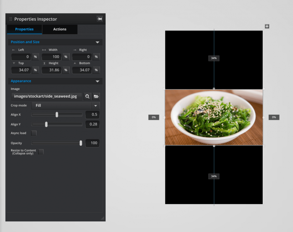
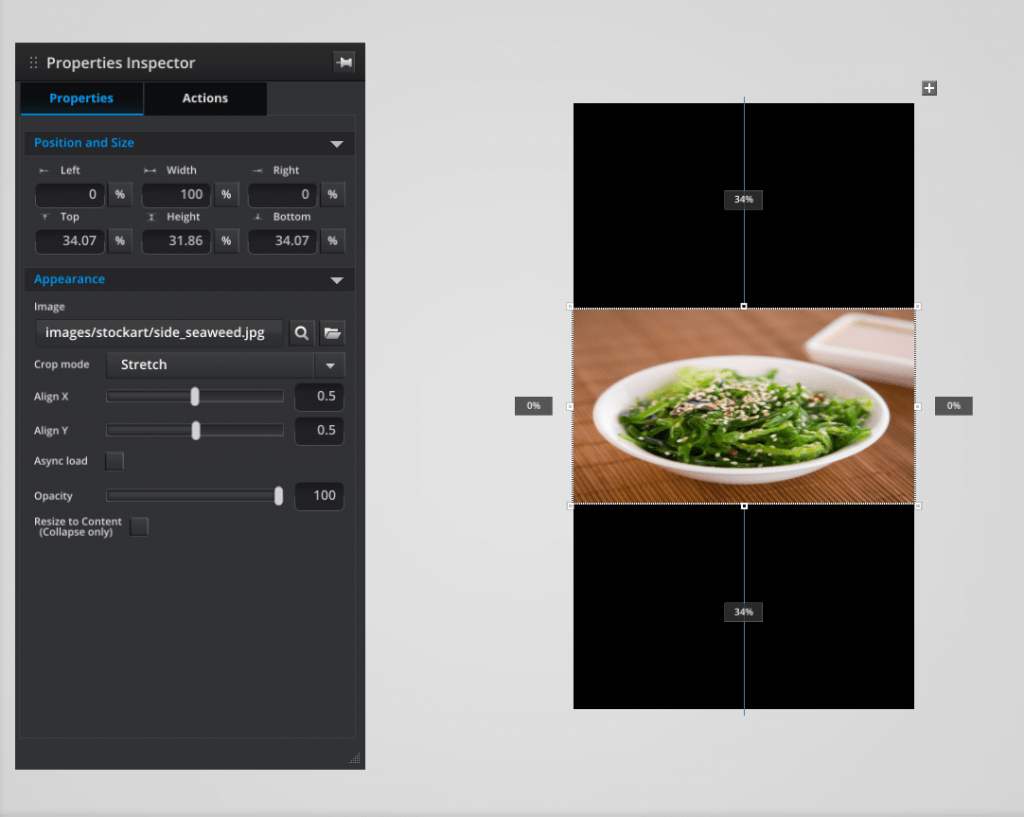
Umajin Editor has different crop modes to use for different effects with graphics and images. All images can be sized using the re-size handles and measurements are shown as you adjust them. In the ‘Properties Inspector’ under the ‘Appearance’ heading there are 3 crop modes provided in the dropdown list. They are best set as ‘Fill’ for image backgrounds, ‘Fit’ for logos and ‘Stretch’ for background textures.
- Fill mode will fill the available space but will be cropped on any constraining boundary. Note that the ‘y’ alignment slider has been used to keep the whole bowl in the center of the image.
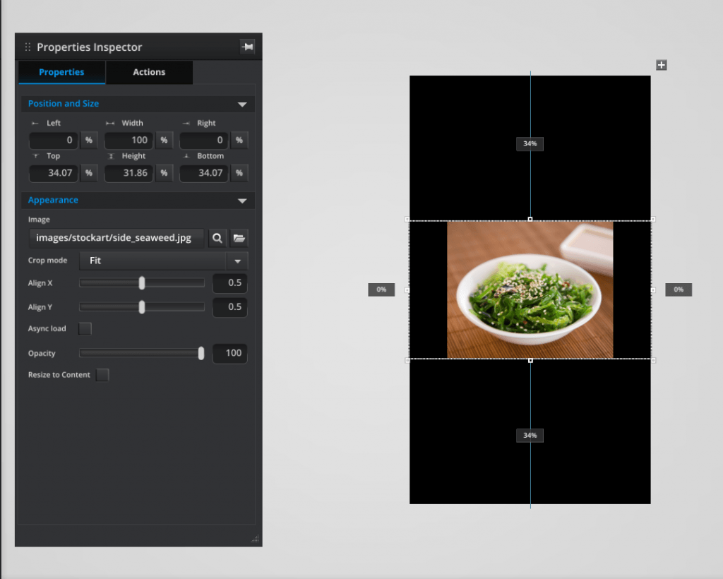
- Fit mode always re-sizes to fit in the available space.
- Stretch mode also fills the available space but will distort an image to fill that space. This is the reason it is best used with background textures rather than images.
The alignment sliders can be used to align the center of interest of an image or the placement of a logo.
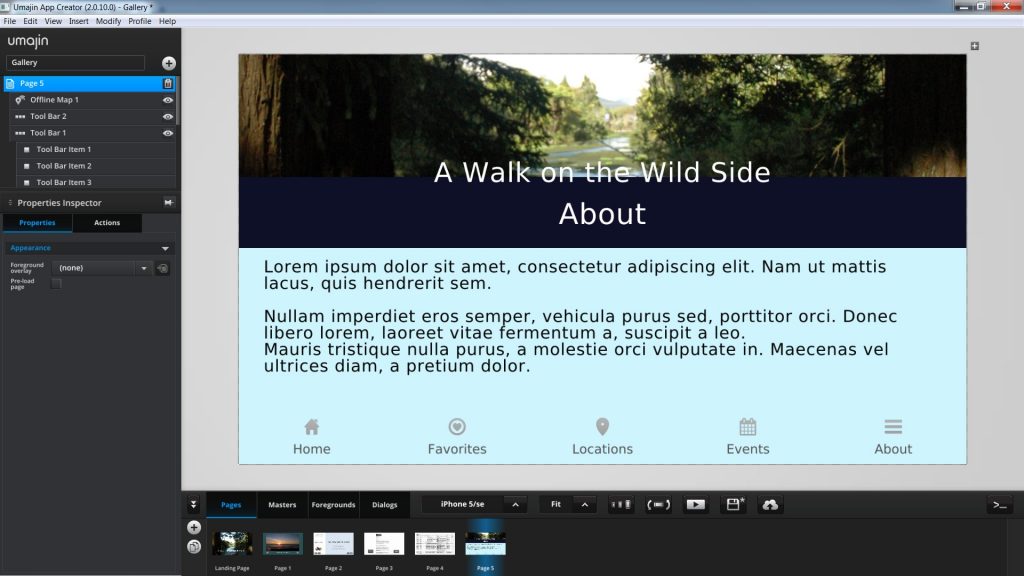
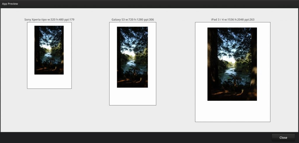
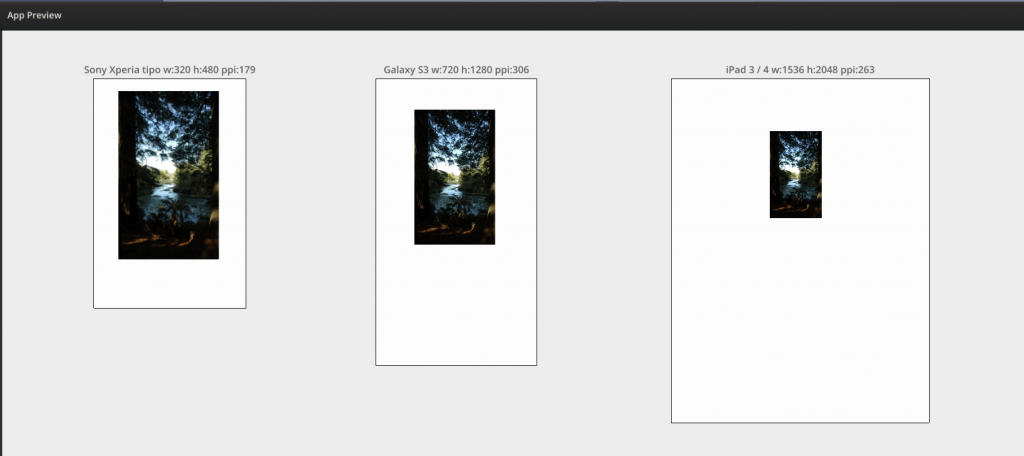
Resizing for Devices
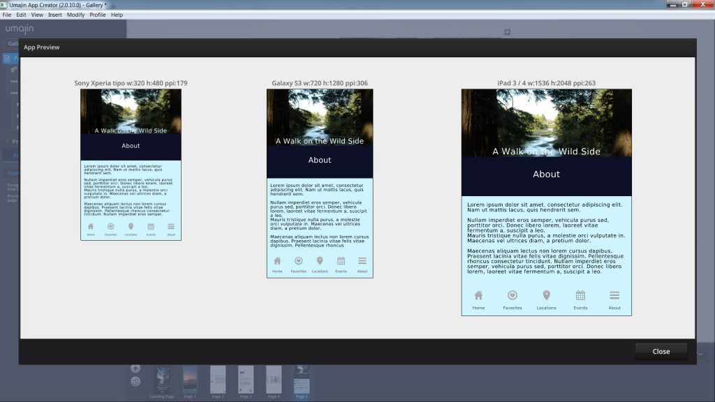
Umajin Editor UI has 2 buttons/functions in the bottom menu bar that help you preview your Project on different devices and also rotate it.
- The first one with 3 sizes of screen displayed, offers the 3 device view ( small, medium and large screen device) so that you can judge how your Project will look across a range of devices.
- The second one with a portrait screen and tilt arrows enables you to rotate your Project from portrait to landscape.
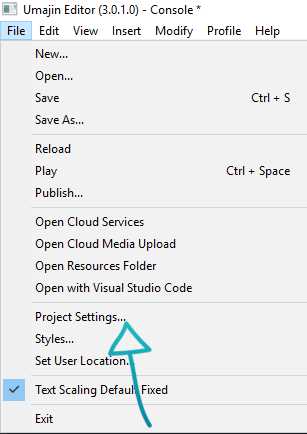
- Opening the ‘File’ menu and selecting ‘Project Settings’ also allows you to lock your Project to portrait or landscape or to support rotation.
Text Resizing
Umajin Editor has 2 dropdown modes for re-sizing the type/font of your text. When a text box is placed on a page, in the ‘Properties Inspector’ under the ‘Appearance’ heading there is a ‘Resize Type’ dropdown menu.
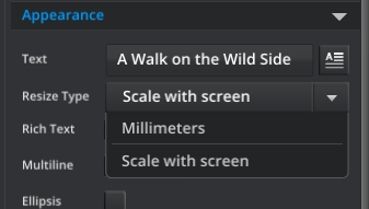
‘Scale with screen’ will scale the type size proportionally to whatever the size of the device screen. This is nearly always the best option. An expert user, however, may find that when setting type size in a panel that is already set to a fixed millimeter height (such as a bottom navigation bar), then leaving the dropdown at ‘Scale with screen’ will mean it is likely that some of your text could be lost as the screen size gets bigger. In this case, choosing ‘Millimeters’ from the drop down allows the type size to be set to a fixed millimeter height across all screen sizes.
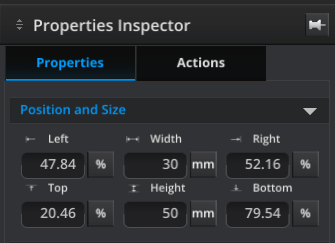
Placement - Measurement versus percentage
In Umajin Editor there are times when using mm(millimeters) rather than %(percentage) is advised. All components are sized by default with width and height as percentages of whatever screen size is on a given device. As components are re-sized they will display proportional to the size of any device’s screen.
To maintain a component to be the same size across all devices, you need to set the appropriate width or height dimension to mm(millimeters).
Resize to Content Property
The Resize to Content property sits as a checkbox on the Text component, the HTML Article component, the Dynamic Article component and the Image component (as Collapse only in Fill mode). This property is designed to resize incoming data and content in a Feed List component. The components would be arranged on a Master and would automatically resize (by moving components up or down) according to the data being fed in.
How to use the Resize to Content Property
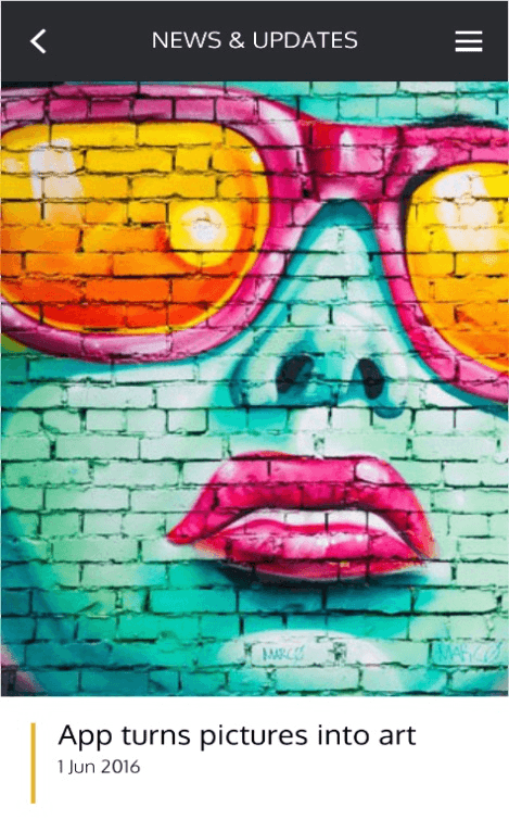
In our first example we have a Master with an image set to Fill and with Resize to Content unchecked. The example set to Fill works as a normal master, where the space allocated for the image is identical to the master layout, and will not change as the image changes. Instead the image is resized to fill the available space.
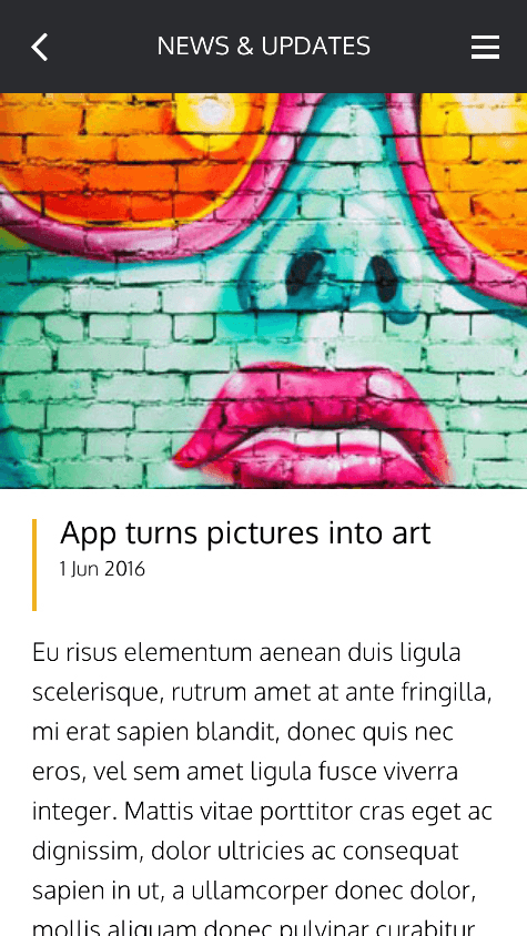
Then we have an example of a Master where the image is set to Fit and the Resize to Content property is checked. This example pushes all other content (the text) on the Master down to make room for the image. This resizes the height of the image while keeping the original width from the master. This means a landscape image will take less space and a portrait image will take up more. The image is fitted into the space pushing the rest of the content down.
In our third and fourth example the Master has an Image component set to Fill mode and we are looking at two different items from our feed. The left hand item has more heading text and an image, the right hand item has only one line of heading text and no image. If the Resize to Content is used with an image in Fill mode – it will not change the shape unless there is no image provided. In this example you can see how the image is either present or not, and when not present(as in the right hand example), all other items move up to fill the space. In the case of the text where Resize to Content is checked, the items below will be pushed up or down depending on how long the text is.