Menu
Arrow
The Arrow Component allows you to easily add arrows to your project. The ability to change the rotation and curve of the arrow, allows you to find the prefect fit.
Setting up an Arrow
- The Arrow Component comes with a default preset look. You can change this by adjusting any of the properties, including the image.
- Make sure the tint is different from your background in order to see it. The Arrow Component’s default color is light grey so if your page background color is also light grey it may not look visible to start with.
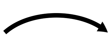
- The image below shows an arrow with the curve property set to -1.
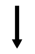
- The image below shows an arrow with the rotate property set to 90.
Properties for Arrow Component
| Image | This is the image the arrow is based on. |
| Stroke Width | This adjusts the size of arrow. |
| Left Slice | The percentage of the overall image, from the left, that is used to make the arrow head. |
| Right Slice | The percentage of the overall image, from the right, that is used to make the arrow head. |
| Rotate | The angle (-180 to 180) to set the arrow. The default is 0. |
| Curve | The amount of curve (-1 to 1) to give the arrow. The default is 0. |
| Arrow Tint | The color to apply on top of the arrow image. The default is light grey (#eaeaea).The tint works for white images, or white images with a black outline. The black will stay black, and the white will take on the tint color. If the image has color, the tint will mix the colors. For example, a yellow image, tinted blue, will turn green. |
| Opacity | This is the alpha channel and dictates how ‘see through’ the arrow appears. |
Events that can Trigger an Action on the Arrow Component
| On Press | Action occurs when you touch or click within the rectangle bounding box of the Arrow Component. |