Menu
Tool Bar
The Tool Bar makes organizing navigation easy. Customize your Tool Bar design, icons and transitions.
The Tool Bar lets you add images/text/buttons/icons in a row that become navigation items. It makes managing your Tool Bar behavior easy, as it handles the layout, animation, selected state and actions for each item.
The Tool Bar is most often made as a Foreground page because then you can just sit it over any number of pages in your app.
The Tool Bar has 3 pre-defined presets that can be loaded into your app, Standard, Grey Blue and White.
You can also design and save your own custom Tool Bar to use across Projects.
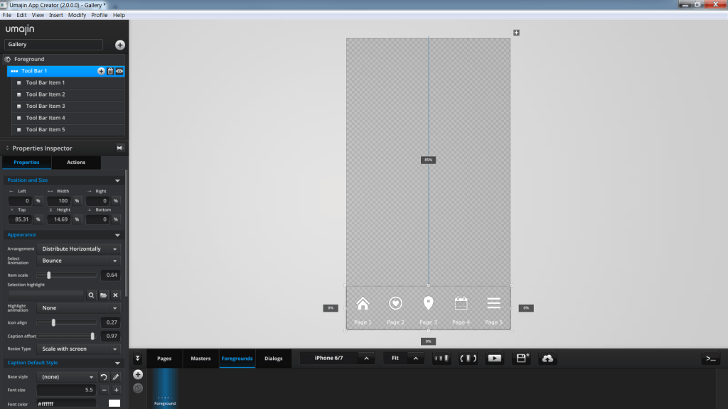
This screenshot shows the preset ‘White’ Tool Bar component placed on a Foreground page.
How to use the Tool Bar Component
- The Tool Bar often provides your primary navigation between pages. As it can sit on multiple pages in your Project, it is very useful to create it as a Foreground page so that you can simply allocate it to sit over as many pages in your Project as you like.
- Either select your Page or a Foreground and insert a Tool Bar component into your Project. It automatically creates a bar at the bottom of the page. Resize and position the Tool Bar as you wish. From the bottom of the Properties Inspector, Properties panel, you can also load a preset Tool Bar already populated with sub-components and then alter the Tool Bar Items to your needs.
- If you are adding your own Tool Bar Items as sub-components using the plus button on the Tool Bar component, then you are taken directly to your ‘images’ Folder to select the graphic elements. Designs for these items can be made in your favorite software and stored in the Project’s ‘Resources Folder’. You can choose a graphic for the default state and one for the selected state, as well as adding any caption text (and text style) you might want.
- The properties listed under Appearance in the Tool Bar component Property Inspector control the arrangement, size, animations, alignment and background highlights for these Tool Bar Items.
- The caption text for each Tool Bar Item can also change when the item is selected. Use the properties in the Tool Bar component Property Inspector under Caption Selected Style to set the changes you want.
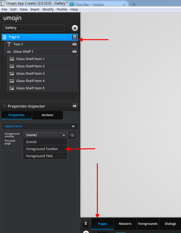
- To add the Foreground page to your pages you click the Pages tab, select the page you want to put the Tool Bar on, and under the Appearance section of the page’s Property Inspector select the Foreground you have just made, from the drop down.
- To add navigation, go back to the Tool Bar you created on the Foreground page, click the Tool Bar Item sub-component, click the ACTIONS tab in the Properties Inspector and add the action you want to the ‘On Press’ event.
- You can add an animation that happens when Tool Bar Items are activated. Select from the ‘Select Animation’ dropdown in the Tool Bar component’s Property Inspector under Properties, Appearance. Choices are Bounce, Zoom, Spin, Squash, Stretch, Rock, Flip, Bounce left, Bounce Right.
Properties for Tool Bar Component
| Name | When components are placed on a page they appear highlighted blue in the scene tree and can be renamed by double clicking in this panel and typing the new name. Components can also be set to be visible/invisible on the page, using the ‘eye’ icon on this panel. |
| Position and Size | Sets position and size. As long as measurements are maintained as percentages it deals automatically with dynamic layout and resizing for different devices and orientations. You can use millimeters to control aspects of size like width or height in order to create a Tool Bar thats size will be maintained across devices. |
| Preset | A Preset is a pre-determined set of properties and files for a component. You can have a Predefined Preset (Umajin created) or a Custom Preset (custom designed by you). Where the component has a Predefined Preset it will automatically be loaded into your app as the default when you insert that component. The ’SAVE’ button will enable you to name and save your preset under the Custom tab. |
Appearance
Deals with the look of the Tool Bar on the page.
| Arrangement | Use the Dropdown to select from Distribute Horizontally, or Distribute Vertically. Choose Distribute Horizontally to spread items evenly across the Tool Bar or Distribute Vertically to spread items evenly up and down the Tool Bar. |
| Select Animation | Dropdown to set the animation when a Tool Bar item/icon is selected. Animations can be bounce, zoom or spin etc. |
| Item scale | Enlarge or shrink items using this ratio where 1 is normal. |
| Selection highlight | Browse the Resources Folder to select a highlight to appear behind an item in the Tool Bar when it is selected. |
| Highlight animation | Dropdown to choose how the highlight will perform when one item on the Tool Bar is selected. It can have no particular movement or it can slide or fade into place. |
| Icon align | Set top/bottom alignment of the icon in the Tool Bar using slider 0(top) to 0.5 (middle) to 1 (bottom) |
| Caption y offset | Set vertical alignment of the caption text for the icon using slider 0(top) to 0.5 (middle) to 1 (bottom) The actual caption text is entered as a property of each Tool Bar Item.(Child of the Tool Bar) |
| Caption x offset | Set horizontal alignment of the caption text for the icon using slider 0(top) to 0.5 (middle) to 1 (bottom) The actual caption text is entered as a property of each Tool Bar Item. (Child of the Tool Bar) |
| Resize type | Dropdown to choose either Scale with screen or Millimeters. Scale with screen – The font size is set to be proportional to the size of the device screen. Works like a percentage. Millimeters – Sets the size of the font to a specific millimeter measurement. The font will stay the same size regardless of the device size. |
Caption Default Style
Set up the style for your caption when it is not activated.
Set the style and appearance of your text using the Styles Inspector. The Styles Inspector is accessible through the ‘pencil’ icon on the Select Style panel and from the Files Menu ‘Styles’.
The actual caption text is entered as a property of each Tool Bar Item.
| Base Style | The dropdown will display all the styles you have set in the Styles Inspector. Whichever style you have selected will populate the properties below. If you alter any of the properties below for a specific use on a page, then clicking the Refresh arrow will revert the style back to its original state. The new style will be added to the dropdown. Organize Style – opens the Styles Inspector. |
| Font size | Set font size using plus and minus buttons. |
| Font color | The color preview shows the color picker. Move around the color pad to select your color you want. It displays with its web hex code at the top and shows the RGB values below. If you know the hex code or RGB numbers you can type it directly into the boxes. |
| Opacity | Set how opaque the text will display on a scale of 0 to 100, with 0 being totally transparent. |
| Font | The drop down displays all the fonts you have in your app. Select the font you want to use. |
| Alignment | Set the alignment of the text. |
| Tracking | Use this property to adjust the distance between your text characters. |
Caption Selected Style
Whenever the caption and icon is selected you can set up a change of font style, size and color so that the change of state is obvious. Use the Styles Inspector to select the style you want and apply the properties you want, using the same properties as listed for ‘Caption Default Style’ above.
Properties for Tool Bar Item
| Name | When components are placed on a page they appear highlighted blue in the scene tree and can be renamed by double clicking in this panel and typing the new name. Components can also be set to be visible/invisible on the page, using the ‘eye’ icon on this panel. |
Appearance
Deals with look of Tool Bar Item on the page.
| Default image | Browse the Resources Folder for the image that will display when this Tool Bar item is waiting for action. |
| Selected image | Browse the Resources Folder for the image that will display when this Tool Bar item is selected. |
| Caption text | Click the ‘A’ icon to type in the caption text for this Tool Bar item. |
Events that are activated on Items in the Tool Bar
‘On Press’ is the only event that can have actions attributed to it on any item set up on the toolbar.