Layout Group
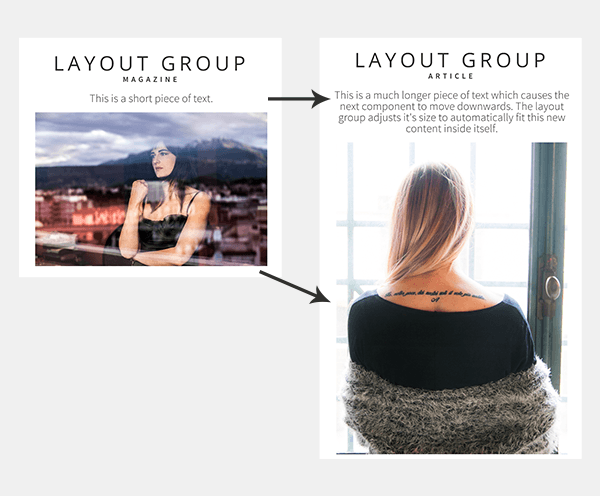
This component groups a set of other components, just like the basic Group component. A Layout Group, however, is able to resize itself to accommodate the different sizes of a component’s content, particularly when controlled by a Cloud feed list; for example, text from a blog post.
Using the Layout Group Component
Images, text and HTML articles are the main components which vary in size and benefit from being in a Layout
Group.
Set the Resize to content property on each of the components which can vary in size. This will cause
them to expand to fit their contents, push down the components underneath to make space, and ultimately
increase the size of the layout group.
Note: If a text or image is empty (for example, an image filename coming from a feed list is blank) then
this will cause the component to shrink down to nothing.
If you don’t want a component to move when components above it increase in size, then under Position and
Size: check the box “Ignore master/layout flow” option on the component. This property is
only available when a component is placed inside a Layout Group Component.
Properties for Layout Group Component
| Name | When components are placed on a page they appear highlighted blue in the scene tree and can be renamed by double clicking in this panel and typing the new name.
Components can also be set to be visible/invisible on the page, using the ‘eye’ icon on this panel. |
| Position and Size | Sets position and size. As long as measurements are maintained as percentages it deals automatically with dynamic layout and resizing for different devices
and orientations.You can use millimeters to control aspects of size like width or height in order to create a group thats size will be maintained across devices. |
| Expand vertically | Checkbox. |
| Clipping Type | Dropdown – options None, Rectangle, Circle. Whichever option is selected will clip whatever is added to the group to the bounds of that shape within the Layout Group Component’s framework. |
| Opacity | Set how opaque the layout group will display on a scale of 0 to 100, with 0 being totally transparent. |
| Resize Rule | Controls how the layout group sizes itself.- No resize: The layout group will not change in size. This makes it work the same as the original Group component.
- Full resize: The layout group will size itself larger OR smaller to exactly fit the components you’ve placed inside it.
- Shrink only: The layout group will get smaller if the components inside it don’t need the original size. But it will not enlarge if they are bigger.
- Grow only: The layout group will enlarge if the components inside it are bigger than it’s initial size, but it won’t ever get smaller.
|