The Single Date picker allows the user to select a date. This date can then be sent into a text, or text entry component. The intention is for these text/text entry components to submit the date as part of a form.
The Date Picker can be placed on a separate page to the form, with the ‘Single Date to Text’ action used to send the value into a visible (or invisible) text component in the form.
Alternatively, it could be placed on the same page as a form, and have its visibility toggled using the ‘Toggle Component Visibility’ action. When the form is submitted, it will submit the date stored inside the Date Picker.
Features
- Customizable colors, icon images, font styles.
- Date can be saved in different formats
- Dates positioned in correct days of the week
- Knows when a leap year is.
- A month/year selector section to speed up Date Picking (hit the header text)
Sub component overview
The date picker is comprised of several sub components:

This is the header, which displays the current date picker’s month & year. The arrow icons will change it to the previous/next month.
The text is fully customizable with Umajin font styles, the icons can be changed, and the background color can be changed.

This is the days of the week header. It indicates the days of the week for the columns of dates below.
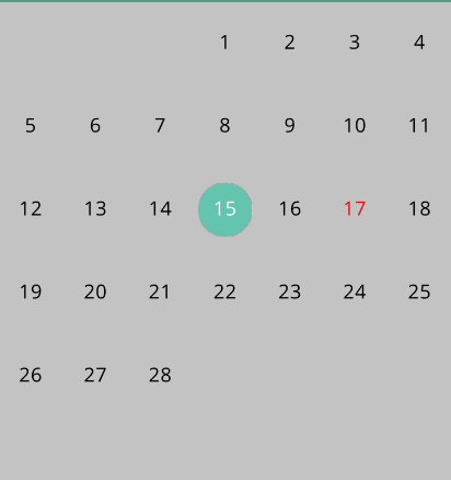
This is the dates mode. It stores all of the dates, correctly placed beneath the corresponding day for that month. It highlights the current date, seen as red in the image above (the month and year must also be same). The selected date has a changeable icon, and its own color. There is one ‘global’ font style used for all dates here, only the colors can be changed for current/selected dates.
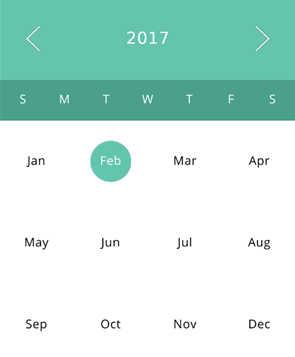
This is the month/year selection mode, which can be viewed by clicking on the header. This saves the user from clicking the arrow icons several times to reach a distant date. The arrow icons change which year is selected. These icons are customizable. When the user presses on a month, it will jump into that month in dates mode. The font styles for the months & icons can be changed here. Every other property is shared with the date mode.
Properties for Single Date Picker Component
| Name | When components are placed on a page they appear highlighted blue in the scene tree and can be renamed by double clicking in this panel and typing the new name. Components can also be set to be visible/invisible on the page, using the ‘eye’ icon on this panel. |
| Position and Size | Sets position and size. As long as measurements are maintained as percentages it deals automatically with dynamic layout and resizing for different devices and orientations. You can use millimeters to control aspects of size like width or height on order to create a component thats size will be maintained across devices. |
| Header Font Style | The properties below allow you to set the font style for the header. |
| Base Style | The dropdown will display all the styles you have set in the Styles Inspector. Whichever style you have selected will populate the properties below. If you alter any of the properties below for a specific use on a page, then clicking the Refresh arrow will revert the style back to its original state. Create Style – opens the Styles Inspector so you can create a new style. The new style will be added to the dropdown. Organize Style – opens the Styles Inspector. |
| Font Size | Set font size using plus and minus buttons. |
| Font Color | The color preview shows the color picker. Move around the color pad to select your color you want. It displays with its web hex code at the top and shows the RGB values below. If you know the hex code or RGB numbers you can type it directly into the boxes. |
| Opacity | Set how opaque the text will display on a scale of 0 to 1, with 0 being totally translucent. |
| Font | The drop down displays all the fonts you have in your project. Select the font you want to use. |
| Tracking | Use this property to adjust the distance between your text characters. |
| Days Font Style | The properties in this section allow you to set the font style for the days of the week header. |
| Dates Font Style | The properties in this section allow you to set the font style for the dates. |
| Months Font Style | The properties in this section allow you to set the font style for the months in the month selection mode. |
| Background colors | The properties in this section allow you to set the background colors for different sub-sections. |
| Header Background Color | The color preview shows the color picker. Move around the color pad to select your color you want for the header. It displays with its web hex code at the top and shows the RGB values below. If you know the hex code or RGB numbers you can type it directly into the boxes. |
| Days Background Color | The color preview shows the color picker. Move around the color pad to select your color you want for the days of the week background. It displays with its web hex code at the top and shows the RGB values below. If you know the hex code or RGB numbers you can type it directly into the boxes. |
| Dates Background Color | The color preview shows the color picker. Move around the color pad to select your color you want for the dates background. It displays with its web hex code at the top and shows the RGB values below. If you know the hex code or RGB numbers you can type it directly into the boxes. |
| Months Background Color | The color preview shows the color picker. Move around the color pad to select your color you want for the months background. It displays with its web hex code at the top and shows the RGB values below. If you know the hex code or RGB numbers you can type it directly into the boxes. |
| Selected Date | The properties in this section allow you to set the properties for the selected date. The selected date uses the font style from Dates Font Style, however it overrides the color property. |
| Selected Date Font Color | The color preview shows the color picker. Move around the color pad to select the font color you want for the selected date. It displays with its web hex code at the top and shows the RGB values below. If you know the hex code or RGB numbers you can type it directly into the boxes. |
| Selected Date Image | Select an image that will be placed behind the selected date to highlight it. The selected image will attempt to maintain its ratio, however a basic circle or a square shape are recommended. |
| Selected Date Image Scale | This property changes the scale of the image component. |
| Current Date | The properties in this section allow you to set the properties for the current date. |
| Current Date Font Color | The color preview shows the color picker. Move around the color pad to select the font color you want for the current date. It displays with its web hex code at the top and shows the RGB values below. If you know the hex code or RGB numbers you can type it directly into the boxes. |
| Opacity | Set how opaque the text will display on a scale of 0 to 1, with 0 being totally translucent. |
| Selected Month | The properties in this section allow you to set the properties for the selected month. The selected month uses the font style from Months Font Style, however it overrides the color property. |
| Selected Month Font Color | The color preview shows the color picker. Move around the color pad to select the font color you want for the selected month. It displays with its web hex code at the top and shows the RGB values below. If you know the hex code or RGB numbers you can type it directly into the boxes. |
| Selected Month Image | Select an image that will be placed behind the selected month to highlight it. The selected image will attempt to maintain its ratio, however a basic circle or a square shape are recommended. |
| Selected Month Image Scale | This property changes the scale of the image component. The month image scale is slightly different to the dates scale, because the month components are physically larger. |
| Current Month | The properties in this section allow you to set the properties for the current month. |
| Current Month Font Color | The color preview shows the color picker. Move around the color pad to select the font color you want for the current month. It displays with its web hex code at the top and shows the RGB values below. If you know the hex code or RGB numbers you can type it directly into the boxes. |
| Opacity | Set how opaque the text will display on a scale of 0 to 1, with 0 being totally translucent. |
| Arrow Icons | The properties in this section allow you to set the properties for the arrow icons. |
| Arrow Left Image | Select the image to use as an icon on the left of the header |
| Arrow Right Image | Select the image to use as an icon on the right of the header |
| Arrow Images Scale | This property changes the scale of the arrow image components. |
| Arrow Images Alpha | Set how opaque the image will display on a scale of 0 to 1, with 0 being totally translucent. |
| Saved Date Format | This property sets the format of the date the calendar will use. When submitted via a form, or a date to text action is used, it will save the date in this format. |