Overview
In this tutorial we will expand the default Form component by adding a phone number field and validating it with actions.
When the phone number input is valid the form will submit. When the form is invalid, it will show error text underneath the input.
Prerequisites
- Completed the Form Basics tutorial, or a basic understanding of the Form component.
- Basic knowledge of changing properties in the property inspector, and moving around components in the Umajin Editor.
- Comfortable adding actions to a component.
Instructions
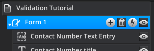
Step 1) We need a Form component. If you have come from the From Basics tutorial, you can use your current form. Otherwise, insert a new Form component into your Project.
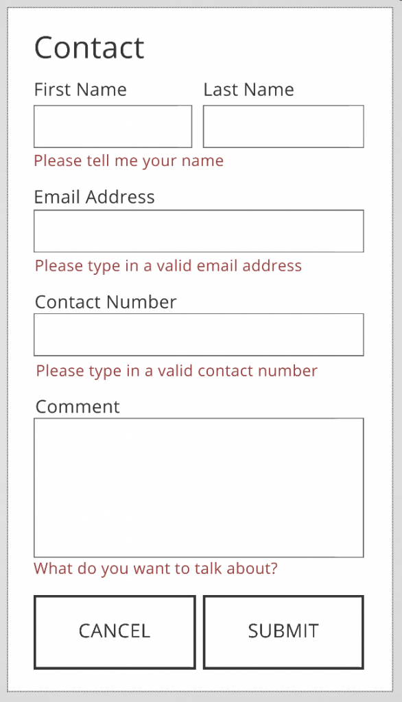
Currently, we only have the default form fields, which have their own validation automatically set up. We are now going to create our own ‘Phone Number’ field and set up validation to ensure it is correct number on submission. If it isn’t correct we want to show an error message, similar to the Form’s default sub-components.
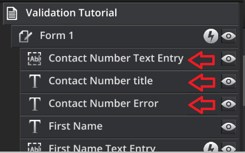
Step 2) We will now add our components. Insert the following 3 components to our Form. Ensure they are nested inside the component. You can name, style, and lay them out as you wish.
- A Text Entry component for our number input
- A Text component for our label
- A Text component for our error message.
Step 3) Ensure that our Text Entry will submit with our form. On the Text Entry component, check that the ‘Enabled Form Submit’ checkbox is ticked, and give it a Form field name.

When a form is submitted, it will send all fields which have the ‘Enabled Form Submit’ checkbox ticked on them, with values associated under the Form field name property. If it doesn’t have the checkbox ticked, it won’t be validated or sent by the form.
Step 4) We will now setup the validation for the Phone Number. On the text entry component for the contact number, find and check the ‘Required field’ property and change the ‘Validation type’ to ‘Phone Number’.
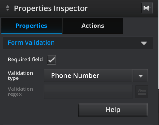
The form will now only submit if a phone number is both present and valid. Test this is play mode if you want to!
The error text is still always visible however.
We only want it to appear when the user submits an incorrect phone number. We also want it to disappear if it’s a valid phone number. We will achieve this with actions.
Step 5) We will hide the text first. On the form component itself, find the ‘On Page Show’ event in the actions tab. Add a ‘Set Component Visibility’ action and set its ‘Component’ property to the error Text, and the ‘Visibility’ property to hide.
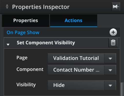
This will hide our error text when we load the page, similar to the default Form sub-components.
Step 6) Now we will show the error text on an invalid input. On the Phone Number Text Entry, find the ‘On Fail Validation’ event in the actions tab. Add a ‘Set Component Visibility’ action, set the ‘Component’ property to the Error Text, and the ‘Visibility’ to show.
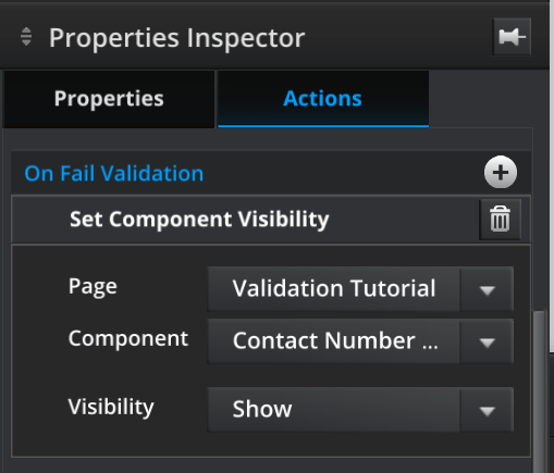
This will make our error text appear when an invalid input is entered.
Step 7) If the user enters a valid number, you’ll probably want the text to disappear. On the Text Entry, find the ‘On Pass Validation’ event and attach another ‘Set Component Visibility action similar to before. Make sure to set the ‘Visibility’ property of the action to hide!

Optional) Attach your Form component to a ‘Simple Form Feed’ in the Umajin Cloud Services, and check the new value is present in the downloadable .csv file. To see how to do this, check out the Form Basics tutorial.
Summary
We have now added a Text Entry component and labels in our Form, set up validation, and show error text for invalid inputs.
You can create your own fields in the same way we have done above, using text entries and validating them using the preset validation types (located in a Text Entry component within a Form):
- Phone Number
- Number
For more complex validation, such as only allowing certain number ranges, you can use the ‘Regex’ (regular expression) validation type.
It is possible to use other Umajin components, such as a custom component or a toggle button inside of a form. To do this, insert the component and ensure it has the ‘Enabled Form Submit’ button ticked.