How to add Actions to a Component
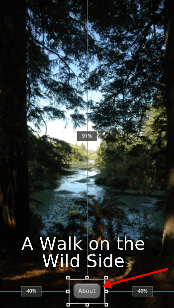
Select the component in the scene tree that you want to add an action to. We are using a ‘Button’ component in this example. When the user presses the button component we want them to be taken to the ‘About’ page.
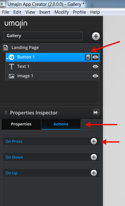
Having selected the ‘Button’ component, in the ‘Properties Inspector’, we open the ‘Actions’ tab.
Select the event you want to add the Action to. In this example we are using the ‘On Press’ event.
Click the “plus” symbol to the right of the ‘On Press’ event.
Clicking the ‘plus’ symbol takes you to the ‘Action Selector’, ‘Basic’ tab (or the last category of actions you had open). There are currently over 80 actions and they are sorted into categories with similar functionality.
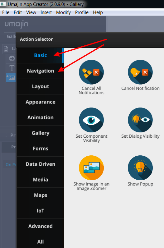
In this example, we are going to select the ‘Navigation‘ tab because when the user presses the button component we want them to be shown the specific ‘About’ page.
Note: There is also a handy search panel on the top right of the ‘Action Selector’. You can type in key words for the type of action you want and get a list of Actions related to the keyword. Results may cross categories.
After selecting the ‘Navigation’ tab, select the ‘Show Page’ action and click ‘Insert’ down the bottom right of the Action Selector. This adds this ‘Show Page’ action to our ‘On Press’ event on our ‘About’ button
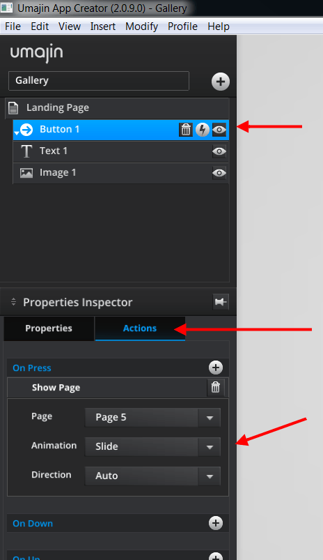
When you add an Action to a Component a lightning strike icon is displayed on the name panel in the scene tree. (See screenshot above) Selecting that icon will open the Action panel of the Property Inspector and display all the actions you have added to that component or Page etc.
If you have added multiple Actions to an Event in the Scene tree they can be dragged and dropped to alter placement and order.
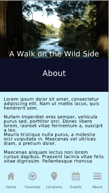
Now when the user presses the ‘About’ button on our Landing Page they will automatically be taken to the ‘About’ page.
The ‘On Press’ event is the commonest event available on components and pages. In this example we added a simple navigation action but events can have many different and more complex actions added to them. For example, we can add actions to send emails, dial phone numbers, link to websites, play animations, time page views before an action takes place, play sound and use maps. We can set many actions that are driven by data stored in the Umajin Cloud Service.
Video of Configuring Actions
Please Note: This video was created using Umajin Editor version 1.4.0.0 so there have been some changes to the UI and naming conventions since then. The main changes you will notice are the new action icons and the new categories the actions are sorted into. The process of adding actions, however, remains fundamentally the same.
Events that can have Actions attached
| On Press | On Page Load | On Before Page Shows | On After Page Shows | On Swipe Up | On Swipe Left | On Swipe Down | On Swipe Right | On Back Button | On Before Page Hides |
| Button | HTML Article | Image | Web View | Nine Slice | Rectangle | Text | Tiler | Toggle Button |
| On Press | On URL clicked | On Press | On Progress | On Press | On Press | On Press | On Press | On Select |
| On Up | On Complete | On Complete | On Deselect | |||||
| On Down | On Error |
| Carousel | Dropdown Menu | Glass Shelf | Hamburger Menu | Tool Bar |
| On Stop | On Menu Opened | On Stop | On Menu Opened | |
| On Change | On Menu Closed | On Change | On Menu Closed |
| Carousel Item | Glass Shelf Item | Tool Bar Item | ||
| On Press | On Press | On Press | ||
| On Focus | On Focus | |||
| On Defocus | On Defocus |
| Animated Feed | Dynamic Article | Field Item View | Feed List |
| On Press | On URL Clicked | On Press | On Press |
| On Empty | On Complete | On Empty | On Empty |
| On Items | On Items | On Items | |
| On Change | On Pull To Refresh |
| Form | Text Entry |
| On Press | On Focus |
| On Before Submit | On Typing |
| On Validation Fail | On Tab |
| On Send Success | On Enter |
| On Send Fail | On Before Validation |
| On Page Show | On Fail Validation |
| On Pass Validation |
| Gallery | Group | Scroll Panel | |
| On Press | On Press | On Scroll | |
| On Change | On Pull To Refresh |
| Gallery Item | ||||
| On Press | ||||
| On Down, On Up |
| 3D Model | Animation | Particle | RenderKit | Video Player | ||
| On Press | On Press | On Press | On Press | On Press | ||
| On Completion | On Completion | On Move | ||||
| On Tick | On Completion | |||||
| On Resize | ||||||
| On Pinch | ||||||
| On Down | ||||||
| On Up |
| BLE | ||||
| On Device Connected | ||||
| On Device Disconnected | ||||
| On Device Discovered | ||||
| On Enable | ||||
| On Disabled | ||||
| On Scan Start | ||||
| On Scan End |
| BLE Items | Camera Visualize | NFC Items | Touch Code Items | Voice Command Items |
| On Recognize | On Recognize | On Recognize[touch_code] | On Recognize | |
| On Recognized Close | ||||
| On Recognize Very Close | ||||
| On Recognize Far | ||||
| On Recognize Closest | ||||
| On Recognize Closest Lost | ||||
| On Device Lost |
| Google Maps | ||||
| On Marker Tapped | On Marker Info Window Tapped | On Location Changed | On Map Press |
| Offline Map | ||||||||||||
| On Press | On Long Press | On Map Move | On Location Changed | On Location Unknown | On Beacon Close | On No Beacon Close | On Route Found | On No Route Found | On Route Waypoint Reached | On Off Route | On Destination Reached | On Point of Interest Click |