Menu
Image
Display photos, pictures, logos and textures in any size and position on the page. The image can be a .png, .jpg,
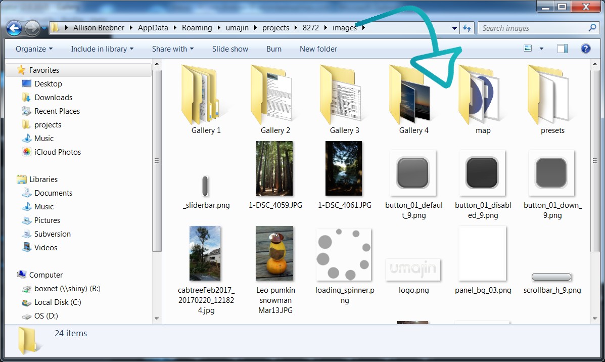
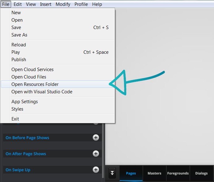
.tga, .svg, or .bmp file that you select from the Resource Folder’/’images’ folder.
 |  | |
Altering properties of the image enable precise control over its presentation allowing for different device resolution and orientation. E.g. aligning photos ensures that a region of interest is kept centered and logos can be set up to always fit in the available space. Images sized 1000px and under are ideal – the larger your image size, the slower your app will run.
If an image dimension is larger then 2000px, it will be proportionally scaled down to have a max dimensionof 2000px.
Re-sizing Images
A background image that is a photo or a texture is best set to ‘Fill’. It will then fill the space that you set the
bounding box to. If there is an area of interest in the photo that needs to be centered across different devices,
the alignment sliders can be easily adjusted.
A logo image is best set to ‘Fit’. This ensures it will remain proportionally sized across devices.
A block/band of color/texture works best in stretch mode. https://help.umajin.com/overview/re-sizing-overview/
Setting size to millimeters rather than percentage will set an image to be the same millimeter size across all
devices.
Properties for Image Component
| Name | When components are placed on a page they appear highlighted blue in the scene tree and can be renamed by double clicking in this panel and typing the new name. Components can also be set to be visible/invisible on the page, using the ‘eye’ icon on this panel. |
| Position and Size | Sets position and size. As long as measurements are maintained as percentages it deals automatically with dynamic layout and resizing for different devices and orientations. You can use millimeters to control aspects of size like width or height in order to create an image the size of which will be maintained across devices. |
Appearance
| Image | Any image/graphic can be selected from the Image folder. You can insert new images/graphics as .png or.jpg files into the Image folder using copy and paste. Note: to see the new image/s you have added, you will need to press the Refresh key bottom left of the Image folder button.(double arrows) |
| Crop modes | Stretch, Fit and Fill. These modes can be used to advantage when inserting different types of images and when you are dealing with dynamic layout and resizing for different devices and orientations.
|
| Align X and Y | These work for Fit and Fill crop modes and let you specify the alignment or region of interest for a picture. This is important because the shape and size of the image component can change depending on the size and orientation of the device. |
| Async Load | This delays loading of the image at runtime – good for big images which are slower to load. |
| Opacity | Set how opaque the image will display on a scale of 0 to 100, with 0 being transparent. |
| Resize to Content | In Fill mode if the Resize to Content property is checked the image will collapse when there is no image available but in Fit mode checking the Resize to Content checkbox causes the image height to change as necessary to display the whole image. When the box is checked the image height will alter but will always maintain the width to height ratio of the original image. |
Accessibility
| Alt text | Alternative text to aid accessibility on the web. |
Events that can Trigger an Action on the Image Component
On PressAction occurs when component is pressedOn DownAction occurs when the image component is held down.On UpAction occurs when the image component is released.
| On Press | Action occurs when component is pressed |
| On Down | Action occurs when the image component is held down. |
| On Up | Action occurs when the image component is released. |