• Overview
    • Introduction
    • User Interface Description
    • Installing Umajin
    • Shortcuts
    • Asset Management
    • Responsive Content
    • Project Icon
    • Text Styles
    • Guidewires
    • Presets
    • Glossary
    • Multi-user
    • Project Events
  • Components
    • Intro
    • Page
    • Basic
      • Arrow
      • Button
      • Circle
      • HTML Article
      • Image
      • Image Zoomer
      • Nine Slice
      • Rectangle
      • Text
      • Tiler
      • Toggle Button
      • Web View
    • Navigation
      • Carousel
      • Dropdown Menu
      • Glass Shelf
      • Hamburger Menu
      • Tool Bar
    • Data Driven
      • Animated Feed
      • Dynamic Article
      • Feed Item View
      • Feed List
    • Forms
      • Form
      • Text Entry
    • Layout
      • Gallery
      • Group
      • Layout Group
      • Scroll Panel
    • Media
      • 3D Model
      • Spine Animation
      • Lottie Animation
      • Avatar
      • Canvas
      • Particle
      • Render Kit
      • Speech Player
      • Video
    • Maps
      • Google Maps
      • Offline Map
      • Offline Map Route Editor
      • Map creation guide
      • Beacon installation for indoor mapping
    • Internet of Things (IoT)
      • Bluetooth BLE
    • Masters
    • Custom Components
  • Actions
    • Add and Configure Actions
    • Basic Actions
    • Navigation Actions
    • Layout Actions
    • Appearance Actions
    • Animation Actions
    • Media Actions
    • Avatar Actions
    • Gallery Actions
    • Form Actions
    • Data Driven Actions
    • Maps Actions
    • IOT (Internet of Things) Actions
    • Advanced Actions
    • Custom Actions
  • Tutorials
  • Cloud Services
    • Overview of Cloud Services
    • Google Analytics
    • Umajin Analytics
  • Publishing
    • Introduction
    • Umajin Editor Lite
    • iOS – Apple App Store
    • Android – Google Play Store
    • Mac
    • Windows
Menu
  • Overview
    • Introduction
    • User Interface Description
    • Installing Umajin
    • Shortcuts
    • Asset Management
    • Responsive Content
    • Project Icon
    • Text Styles
    • Guidewires
    • Presets
    • Glossary
    • Multi-user
    • Project Events
  • Components
    • Intro
    • Page
    • Basic
      • Arrow
      • Button
      • Circle
      • HTML Article
      • Image
      • Image Zoomer
      • Nine Slice
      • Rectangle
      • Text
      • Tiler
      • Toggle Button
      • Web View
    • Navigation
      • Carousel
      • Dropdown Menu
      • Glass Shelf
      • Hamburger Menu
      • Tool Bar
    • Data Driven
      • Animated Feed
      • Dynamic Article
      • Feed Item View
      • Feed List
    • Forms
      • Form
      • Text Entry
    • Layout
      • Gallery
      • Group
      • Layout Group
      • Scroll Panel
    • Media
      • 3D Model
      • Spine Animation
      • Lottie Animation
      • Avatar
      • Canvas
      • Particle
      • Render Kit
      • Speech Player
      • Video
    • Maps
      • Google Maps
      • Offline Map
      • Offline Map Route Editor
      • Map creation guide
      • Beacon installation for indoor mapping
    • Internet of Things (IoT)
      • Bluetooth BLE
    • Masters
    • Custom Components
  • Actions
    • Add and Configure Actions
    • Basic Actions
    • Navigation Actions
    • Layout Actions
    • Appearance Actions
    • Animation Actions
    • Media Actions
    • Avatar Actions
    • Gallery Actions
    • Form Actions
    • Data Driven Actions
    • Maps Actions
    • IOT (Internet of Things) Actions
    • Advanced Actions
    • Custom Actions
  • Tutorials
  • Cloud Services
    • Overview of Cloud Services
    • Google Analytics
    • Umajin Analytics
  • Publishing
    • Introduction
    • Umajin Editor Lite
    • iOS – Apple App Store
    • Android – Google Play Store
    • Mac
    • Windows
Overview > Introduction > Presets
Contents
  • Intro
  • Interface Description
  • Installing Umajin
  • Shortcuts
  • Asset Management
  • Responsive Content
  • Project Icon
  • Text Styles
  • Guide Wires
  • Presets
  • Multi-user
  • Project Events
  • Glossary

Presets

A Preset is an easy way to apply pre-defined styles to a component. For example, when you add a button, instead of configuring the color, size, font, icon and location for every button in your project, you can load a pre-set configuration that automatically styles all your buttons for you.

Some Components have a range of Presets included at the end of the ‘Properties Inspector’panel that you can load, view and select from. You can also configure a Custom Preset, thus saving your own branded components for an easy and quick way to apply color schemes, styles and branding throughout your project.

Applying Presets

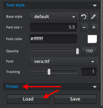
Once you have added a component to your project, go to the ‘Properties’ tab in the ‘Properties Inspector’, and at the bottom of the whole panel press the ‘Load’ button to  open the Preset Selector.

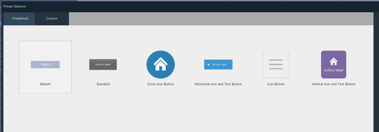
Here you will find tabs for Predefined and Custom presets, simply choose the preset you want to apply to your component from the Predefined tab or create you own and save in the Custom tab. The screenshot below shows the Button Component Presets.

Creating Custom Presets

Create your own Preset by building your assets, putting them in your ‘images’ folder and then selecting them in the Properties panel. The ’SAVE’ button will enable you to name and save your preset under the Custom tab.

  • Umajin
  • Developers
  • Support Home
Menu
  • Umajin
  • Developers
  • Support Home