Menu
Tiler
Repeat an image in a tiling pattern. This component has presets that can be loaded into your Project.
This component enables you to create a tiled pattern from any image/graphic you have in your ‘images’
folder. The default tiler is a textured background image but you can also tile any graphic, logo or image
you have stored as an asset in your Project’s ‘Resources Folder’/’images’ folder.
How to use the Tiler Component
The Tiler component automatically loads a default graphic. You may change the tiler to use any image in your
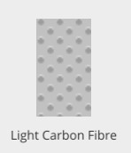
‘images’ folder, or select from the presets already created, see some examples below:
 |  |  |  |
You can save and load your own presets as well, for use across App projects. The tiling scale and opacity is
easily changed in the ‘Properties Inspector’ panel.
Properties for the Tiler Component
| Name | When components are placed on a page they appear highlighted blue in the scene tree and can be renamed by double clicking in this panel and typing the new name. Components can also be set to be visible/invisible on the page, using the ‘eye’ icon on this panel. |
| Position and Size | Sets position and size. As long as measurements are maintained as percentages it deals automatically with dynamic layout and resizing for different devices and orientations. You can use millimeters to control aspects of size like width or height in order to create a tiler thats size will be maintained across devices. |
| Preset | A Preset is a pre-determined set of properties and files for a component. You can have a Predefined Preset (Umajin created) or a Custom Preset (custom designed by you). Where the component has a Predefined Preset it will automatically be loaded into your app as the default when you insert that component. The ‘LOAD’ button opens the Preset Selector, which has tabs for Predefined and Custom, so you can choose which preset to load for your component. Create your own Preset by building your assets, putting them in your Image folder and then selecting them in the Properties panel. The ’SAVE’ button will enable you to name and save your preset under the Custom tab. |
Appearance
| Image | Select the filename of your image/graphic to be tiled from your Image folder. |
| Tile scale | Sets size of tiles. Scale of 1 to 100 with 100 being the maximum individual size. |
| Repeating | Select from dropdown of Repeat All, ( whole page tiled) Repeat Horizontal, Repeat Vertical. |
| Opacity | Set how opaque the image will display on a scale of 0 to 100, with 0 being transparent. |
Events that can Trigger an Action on the Tiler
Component
| On Press | Action occurs when component is pressed |